I’ve been meaning to post about this for a while now. It was my Dad’s birthday a couple of weeks ago which meant I of course needed to make him a birthday card for the occasion!
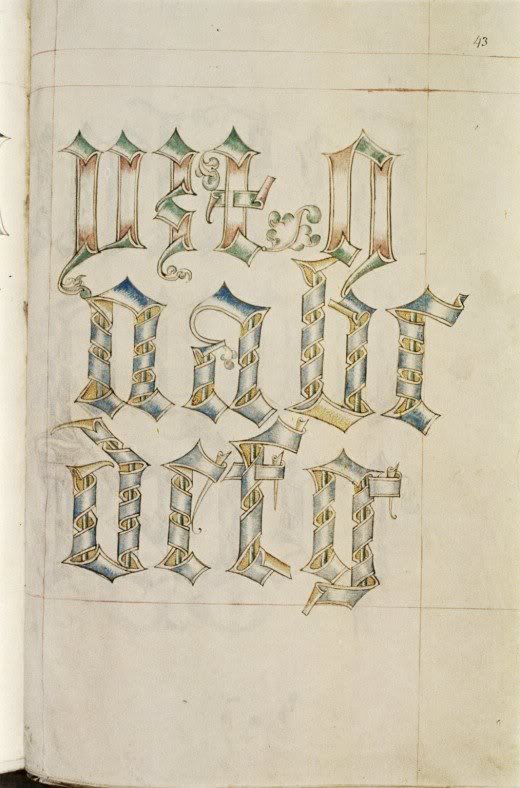
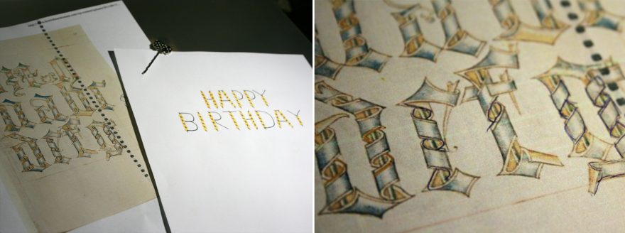
I took inspiration for the design from some Tudor lettering I discovered a while ago. I liked the way the ribbon weaved around the letters and wanted to make something that was similar yet a little more modern.
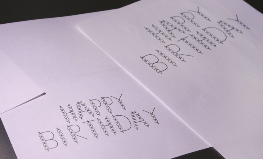
Because of the detail in the letters and the small space it would need to fit into, my initial idea was to create the artwork at a larger size and then print it onto the smaller card.
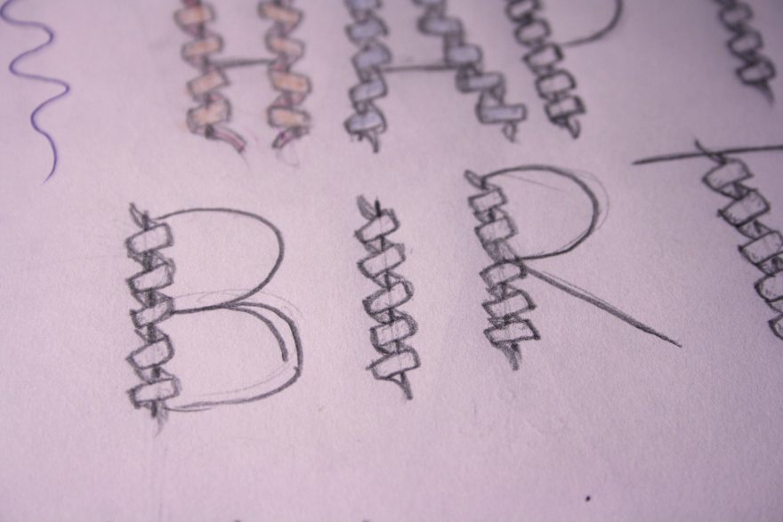
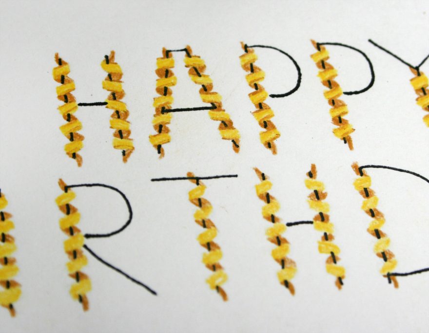
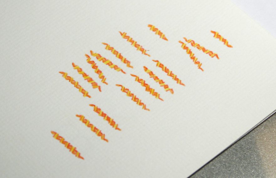
When I finished the letters, the ribbons didn’t really look like they wrapped around but instead they just looked like blocks of colour. What I decided to do was print out and trace the original lettering to get a ‘feel’ of how the ribbons curl.
While the shapes were correct, my ribbons weren’t showing the curve from the front of the ribbon to the back so I needed to somehow better illustrate this. I decided to draw outlines, similar to the original reference, along the edges which highlighted the curve looping round.
I thought I had finished the card design and just had to print it. I even found more of the light textured card stock I thought had been all used up. Things were coming up Milhouse!
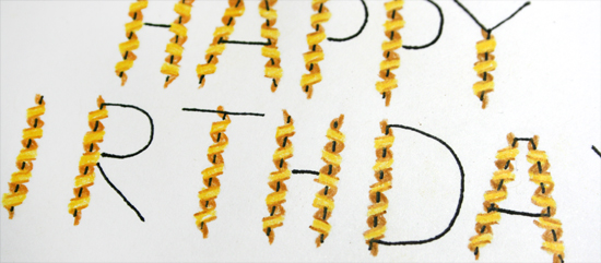
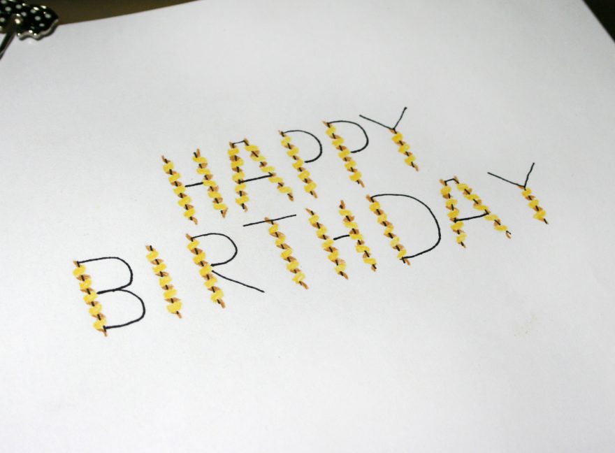
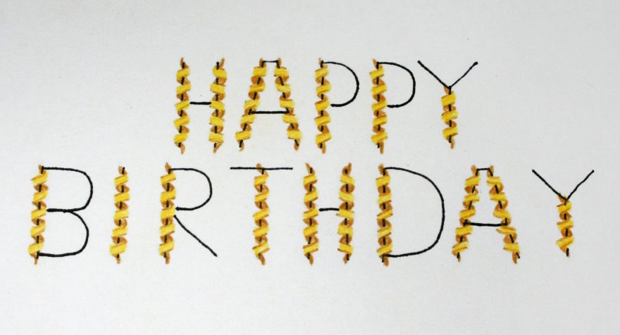
Unfortunately, my printer didn’t agree with this optimism and decided to print the card with a yucky green tinge. I didn’t have time to fix this so I started again, this time drawing directly onto the card. This was a lot harder than the first time because I had to scale down the letters to even smaller than before.
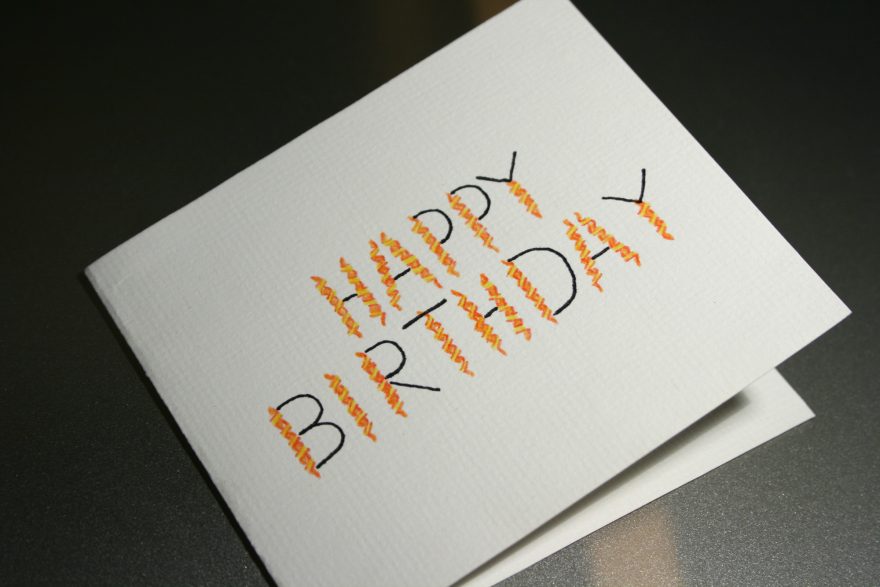
I actually ended up not drawing in the lines through the ribbon because I thought it actually looked better. Looking at it now though I think I should have stuck to my original plan ^^;.. I don’t think it’s that bad though and the my dad liked it anyway, which I think is the most important thing ^_^.
What do you guys think? Let me know in the comments!


Love it!!
Thanks 😀