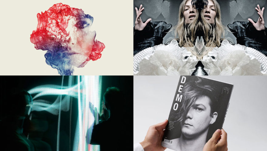
Once again, Semi-Permanent returned to Brisbane for its 6th year with eight new talented speakers. From artists to architects, the Brisbane line-up seemed to be one of the most diverse range of creatives we’ve ever had. It was refreshing to spend the day sitting and listening to their stories about their humble beginnings up to their work and experiences now.
Moffitt.Moffitt.
It wasn’t that long along that Moffitt.Moffitt. were speaking at Sex,Drugs & Helvetica and it was nice seeing them back to talk about their other projects. They highlighted their long bromance together, from studying to travelling, and how they both knew they wanted to job that paid for their passion of creating. When discussing work, they talked about having a fluid and flexible process when approaching projects, wanting their work to seduce people with beauty and intelligence, to be enchanting and intriguing and also had to say something to its viewers.
The duo discussed some of their recent projects which included Eye Spy that showcased the possibilities of print and how a printer could bring ideas to life. Despite the slow decrease in print media production, their work actually helped Lindsay Yates Group gain more business from its release. Another job showcased was GE Two Words, a trans media project that gauged people’s concerns and feelings by asking them to select just two words that highlight the biggest challenges facing Australia. The project existed online and as a live installation with a light sculpture that visually changed motion and sound to the responses given by users. They also discussed several other projects including their branded identity for MART Gallery – an art gallery showcasing artworks inspired by music and their new personal project Bloke – a tablet publication for the modern Australian man. Each project usually contains multiple elements as the brothers like to create design packages that extend the work beyond just one piece.
Through their processes and finished projects, Moffitt.Moffitt stated they like to empower people who may otherwise not have a voice in media, use their mind and hands with analogue techniques (or combining it with digital) and along with all that – have fun. The brothers ended on a couple of notes about selfless promotion (the best promotion is promoting others) and that in the world of the internet, knowledge does not equal power but creativity can because if you’re in the middle, you can be forgettable.
Ben Briand
Our next speaker was Ben Briand, a film maker from Sydney. After leaving university Briand wondered how he would come to be known as a ‘film maker’ and according to him, you need a beard, headphones and if you’re lucky, a crew :P. He likes to tell stories with emotion and enjoys dissolving the boundaries that come from certain rules in film mediums.
Briand’s creative process started when he worked in a video store putting returned videos back on the shelf and seeing their various covers. He become interested in futuristic violence and horror films like Robocop and was also introduced to surrealism in movies like Nightmare on Elm Street. Later on this evolved into art cult movies like Eraserhead, all the while enjoying the beauty and poetry in more classical and romantic films. These influences encouraged him to make his own films with his own props. This enthusiasm continued into his university degree, taking every opportunity presented to him by studying lots of disciplines and making films with his friends acting in the film or as his crew. Through this he made his own opportunities which Briand believes to be important because you should make those opportunities into something you want to show people.
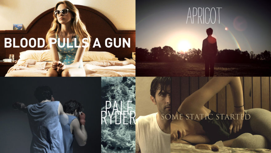
In 2010, Briand was trying to define his voice and ended up doing 3 films over one year with similar themes surrounding memories, particularly episodic memory. The process of making these films began by finding the sound of the film, listening to tracks that would help him evoke what the film will feel and sound like. From these sounds, he put together a look book (or mood board if you will) of ideas and imagery before finally writing the script. Once the script is written and the money is available for filming, Briand finds it still ends up taking about seven months before he begins shooting. This happened when creating the film Apricot which he was provided a grant for and included the requirement of posting the final short on Vimeo. While Briand originally didn’t like this idea, he soon found himself receiving emails and fan art from viewers, including a remake by children. The short ended up becoming like a poster boy for Vimeo. This lead to another insight by Briand that “your most defining work is always home grown”. After creating his own defining work, he actually ended up receiving more TVC work than he did from his previous promotional reel.
Briand left with us with some of his own observations – don’t wait for the perfect work, carve out your own voice, you are a product of your work and ideas aren’t yours so don’t be precious with them.
Kelly Smith
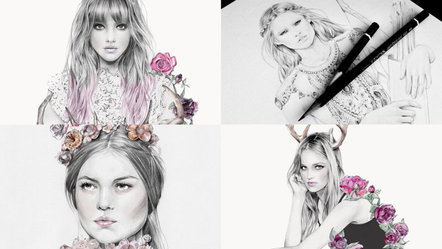
Our last speaker for the morning session with Kelly Smith, an illustrator who you may know as the girl behind Birdy and Me. Her illustrations are mainly focused around fashion and beauty and she has been lucky enough to work with many big clients. Since a young age, Smith always enjoyed drawing however she only saw it as a hobby, not as a job path. When she went to university studying graphic design and photography, it wasn’t until her last year that she discovered contemporary illustrators and their work for magazines. After seeing this, Smith started to incorporate illustration into her design work and slowly built up her drawing skills.
She started to draw in her spare time but began to wonder how her work would be seen. Luckily, she soon discovered the power of social media in increasing her visibility. She shared many of her illustrations on MySpace while also printing card sets to send out as samples to publishers who might be interested in printing her work. This process built up a network of people and allowed her to receive constructive positive and negative feedback from publishers and becoming aware that sometimes your work won’t appeal to everyone. Her network paid off when she got a call from Vogue Australia asking her for an illustration for a spare page in their next run.
Smith started to take on illustration work after this while also having a day job and while she was not originally earning enough, she was definitely busy enough. She decided to make a plan to quit her job and trial making illustrations full-time, which ended up with her continuing illustrating and her artwork having a roll-on effect to new projects. Some of her favourite jobs have been collaborations with other creatives. This includes work for L’avion where she was given a lot of freedom in the work she created for a variety of scarf prints and Samantha Wills where she collaborated with the owner to create a stationery set. Smith has also approached other artists for work including Blacklist Studio where they created a 70s’ inspired print that incorporated each of their respective styles.
In regards to her process, Smith always begins with the reference images she is given or collects her own references through photographing friends. This in turn is slowly put together in a sort of collage to make a unique image for the final reference. The image is then roughly sketched out before being outlined and scanned to digitally clean up . The water colours elements are then painted in and scanned again, allowing her to layer and adjust tones and shadows in Photoshop to create the final artwork. Smith’s finished off her presentation by saying that being an illustrator is a business where things can change overnight and to just get work out there into the public eye and hopefully opportunities will come.
Miso
Our next speaker was Miso who is a studio artist currently residing in Melbourne but who was born in the Ukraine. She described her parents as being anti-establishment which lead to her having a punk upbringing that encouraged the ideas of DIY and teaching herself. This would resurface later on while attending art school when she wasn’t interested learning how to paint, but what to paint about and ended up changing her degree to philosophy instead. Before the change, Miso would skip her art classes to plan and make street art, mainly framing doorways. These works reflected Miso’s travels between the Ukraine and Melbourne and not really feeling completely part of either country. Many of the works reference people she knew or met in her home country. While she enjoyed making these illegal artworks, various negative happenings caused her to leave the street scene and turn towards paper cutting.
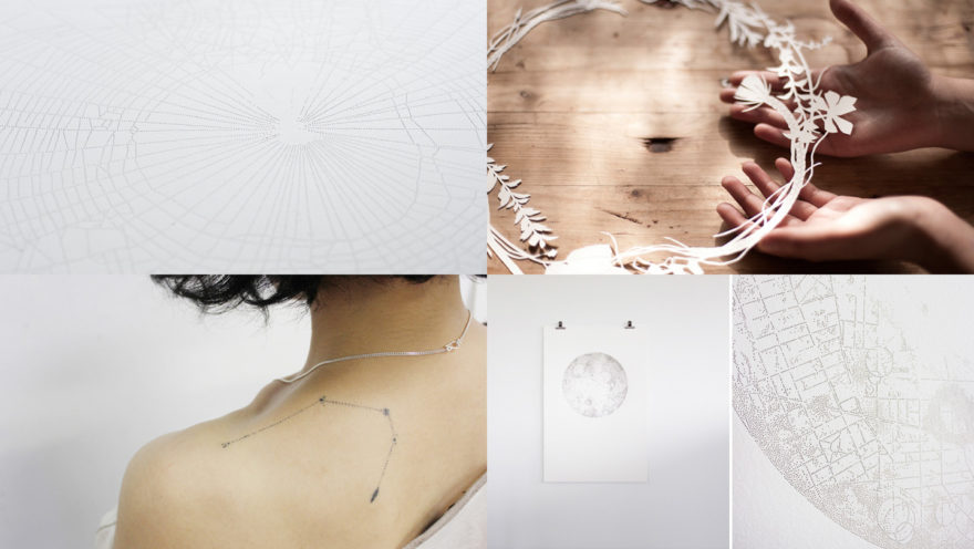
While working on a detailed snake paper cut piece, she wanted to add more detail to the skin and decided to pinprick the paper. She became interested to this element and slowly started to create more pieces using this technique while slowly moving into fine art. With her latest artworks, she wanted to take a minimal item (like paper) and sculpt back from it. This has led to her works with moons and stars, which actually contain paths and streets of her journeys around the world. Because she only kept a diary of her travels, she wanted to bring them into the physical space with the artworks becoming a map of where she went. The art pieces are actually physically painful to make because each dot is hammered through the picture however Miso likes that the work doesn’t really show this pain because they are beautiful at the end of the process. The memories they evoke are comforting to her and she finds it interesting that once the artworks are sold, they have their journey around the world.
Artworks aren’t the only thing that Miso creates – she also uses the same styling in her tattoo work on her friends. The tattoos are also embodiments of memories and are often given to someone as a trade for something like food, wine, clothes and drawings. Her take up of tattooing gave her a rediscovered adrenaline that she used to have when making illegal street art (though she’s apparently now looking for something new). At the moment she has begun to publish an annual book of the tattoos she’s created that also include Polaroids and tattoo sketches as a more collated memory book.
March Studio
March Studio are the first architects we’ve had at the Brisbane event before and it was interesting to learn more from Rodney Eggleston about the work involved in their profession. He showed us the large variety of work the studio had created and it was interesting to see how much of it had a temporary lifespan of about 6 to 12 months with this being the main work shown during the presentation. The first job Eggleston did was for a bar tucked away in a laneway, creating the work for free straight out of university. It ended up getting a lot of publicity and was even featured in a magazine however they were not credited for it. When they enquired about this error, the publisher didn’t realise the space had actually been designed, figuring it had just been put together. While a bit downhearted, Eggleston liked that they had designed something in such a way that it was not obvious to other viewers.
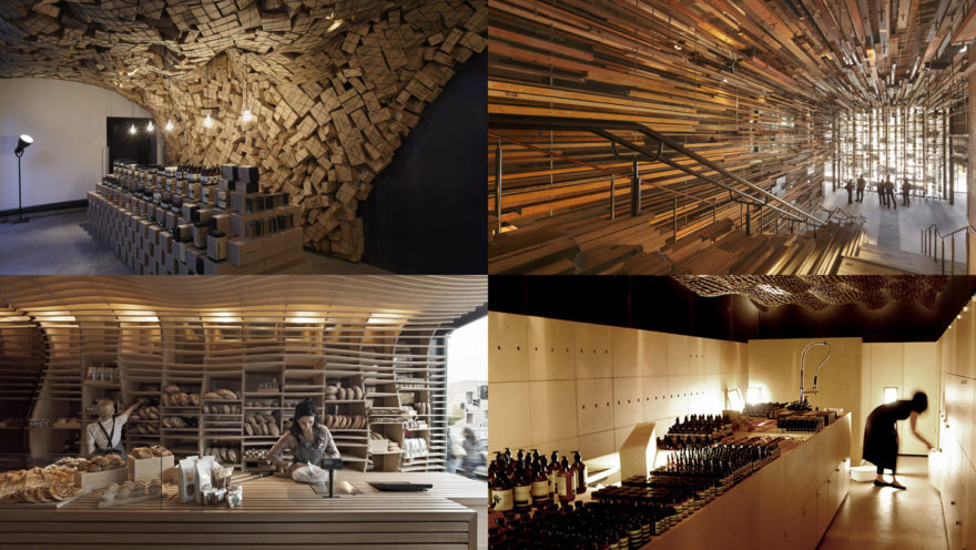
Another temporary installation was a cardboard house that children could draw all over. The same idea was also utilized in Perth with pagoda styled house. The theme of children adding their own input into the design continued into their work for the Brisbane library where they built the CBD out of blocks that kids could add, change or subtract from. It was here that Eggleston highlighted how great an asset the computer was to their business in allowing them to calculate large sums of pieces, in this case being 15,000 different sized blocks.
Other projects that tested their skills were often short and sharp with limited materials and time to put together. This was highlighted with their work for Aesop where they used the actual product boxes to create a unique space by stacking them and creating small shelves for the products, all of which was turned around in a few days. On a similar occasion, they also used netting with boxes tossed up on top to fill the space. Eggleston said he enjoyed working with lots of different materials and whenever they were asked to fit out a new store, he tried to contextualize it to the city itself. My personal favourite was the store that used the Aesop bottles in a wave formation on the ceiling – a great space to implement a creative idea.
Eggleston finished off his speech by presenting two newer projects that used LED signage and amazing light fit-outs throughout the store. Definitely worth checking out more of their work on their website.
Seb Lester
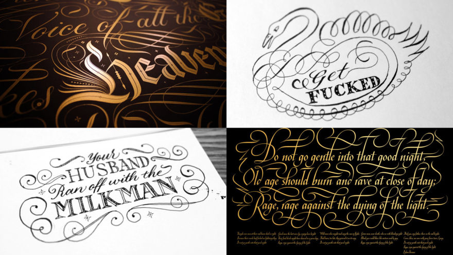
Seb Lester was one of our international speakers from the UK who is both a designer and artist in the medium of type and lettering. His love for lettering came from his young days as a BMX rider where he would copy the logos of the different bike companies. Later on at college, he studied painting that placed a lot of emphasis on the craftsmanship which can be seen in his work today. During his studies he came across a book with type by Neville Brody and had an epiphany moment. His first explorations of type were all drawn by hand, attracted to drawing bold simple letters similar to those from the BMX logos before gradually evolving it into more expressive letter forms. By the end of his studies, he had created his first commercial typeface which happened to be picked up by Rolling Stone magazine to be used for one of their articles! Rolling Stone also gave him his first break when they used some of his artwork from his student illustrations.
After college, Seb Lester was employed at Monotype which laid the foundations for his career and type skills. One of his star typefaces was the Neo Sans Intel used by Intel across all of their media and advertising. During his time at Monotype he also refreshed the The Daily Telegraph logo to modernise it, created the corporate typeface for British airways and also designed Neo Sans which is used by Metro in Melbourne and UK Labour Party as well as many other numerous (and humorous) applications. We were lucky enough to see more of the work that goes into a typeface by being shown a variety of sketches used to form the ideas for Neo Sans, with Lester stating the need to not be precious with sketches. He also told us how much work goes into making a typeface with every single letter and glyph. The Soho typeface for example took a whooping three years to create!
After producing many well used corporate typefaces, he realised that despite his famous work he was unknown, causing him to start experimenting with typefaces and descriptive words. He also began to become particularly interested in anagrams. His work paid off when he started to get requests for work like creating the Catcher in the Rye cover for Penguin Books. His interests have currently turned towards calligraphy and he has been practising regularly. He likes to use many different materials and enjoys the ease of quickly creating calligraphy pieces. His work also has an online presence on Instagram and Vimeo, with one video even going viral causing him to receive many strange emails.
Seb Lester left us with final words of advise about the importance of hard work and focus but most importantly – to ‘Believe in Yourself’.
Lilli Waters
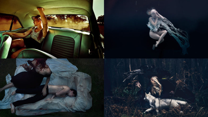
Next speaker up was Lilli Waters who is a photographer from Melbourne. Artists seem to run in her family and growing up she liked to sing, dance and play violin. She became interested in photography at a young age and ended up studying it at university where she also fell in love with Photoshop during her second year. After finishing her studies she did many soul-destroying jobs and realised that she didn’t want to take photos for people, she wanted to develop her own style. She put it off until only a few years ago when she decided to get her stuff together and originally wanted to be war photographer. However after putting this off as well, she realised that she could still do something good without having to enter a war zone.
When asked about her ideas, Waters says she has difficulty explaining them because they seemed to be preserved in her thoughts with photography possibly being a release of her unconscious feelings. She has a passion for classical themes and is attracted to Australian landscapes and the female form. A lot of ideas she comes up with end up on the impossibility pile however this doesn’t stop her from pushing her comfort zone by pursuing to evoke an intimate presence with the subject. While working on a shot, she likes to trust her eyes instead of following photography techniques since she’s never been a fan of the rules. Instead, she is more interested in how the light, angles, expressions and body positioning are presented. Her first solo exhibition was She Raw which was themed around women. It was a very collaborative experience where each individual woman helped in developing the idea and location for their photograph. What’s interesting is that all the models came from a shout out on Facebook which showed Waters something done on your own is nothing without a supportive network.
Her photography work makes her face many challenges, one being the tug between fantasy and reality and frustrations of things going awry or not working out the way they were envisioned, often causing a love/hate relationship with her work. There have also been tough times that have made her want to quit photography because of self-doubt taking a hold of her. It was after this down period that she realised that would always be people who knock you down and that it’s important to push through that.
Her advice to come out of her experiences was to shoot anything until you find your own style because this will help you stand out from others. It’s also important to hustle like crazy by emailing others constantly, to remember that you are your own worst critic, to take constructive criticism and that nothing is original so shoot what and how you want to.
Nicholas Felton
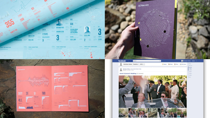
Our final speaker of the day was Nicholas Felton, most known for his infographic annual reports on personal data and the current Facebook timeline. Mainly focusing on his annual reports, Felton talked about his process for creating his work. The first step was collecting the data itself for the reports which Felton over the years has created a number of different methods for. One way was the archaeological approach of gathering data from found objects. He used this method when creating the annual report based off his dad’s life after discovering many details of his travels, jobs and other interesting facts in his artefacts after he passed away. Another option was hoarding – collecting everything you can and recording it. This technique was used across several reports to add new details, cover mileage and for comparing different years. This type of collection did have a few downsides though including its addictive nature over time. A third technique used was sampling by taking snippets of data. In 2009, Felton used this technique in the unique way of getting others to give him the data he needed, giving them a site to add details about their views on his mood and time with them.
Once all the data is collected, the second major part of the process was the coding. Originally he used to create his artworks manually but now he uses Processing to create the infographics before moving them into the report. This part is partly coding but also partly exploration of the data and how it can be presented. Felton showed us lots of his experiments and how they evolved from his original ideas of displaying the data. Often this will also require him to seek out solutions in the Processing community for particular layouts and sometimes he had to tackle his coding problems himself. Once he’s happy with the infographic, we would export it as a vector and bring into illustrator, slowly building up the various details to create the final annual report.
Felton finished his presentation with some interesting closing thoughts. Often in design we are taught how to work with image and text and due to the age of the internet there is now a lot of information out there. So if you’re a designer that can also work with numbers, the better set you will be. He noted the value of determinism and malleability in our design careers and lastly and probably most importantly, to ‘just make stuff’.
In the Bag
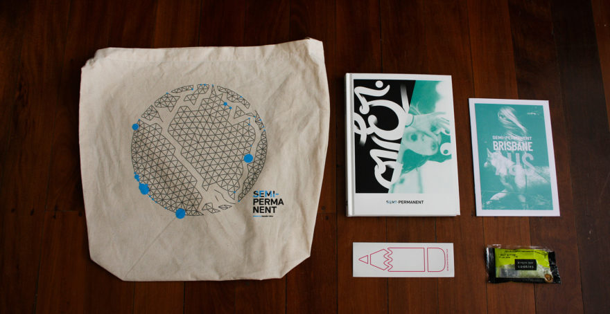
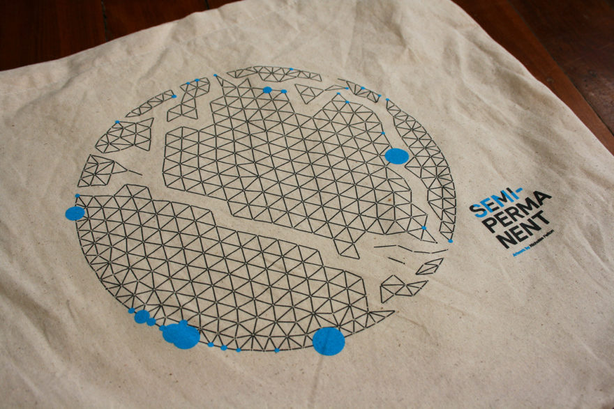
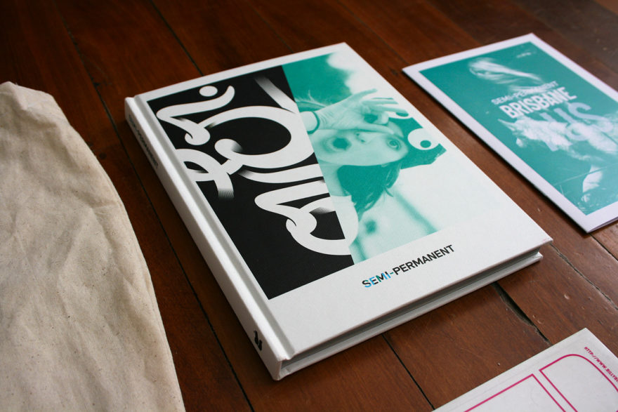
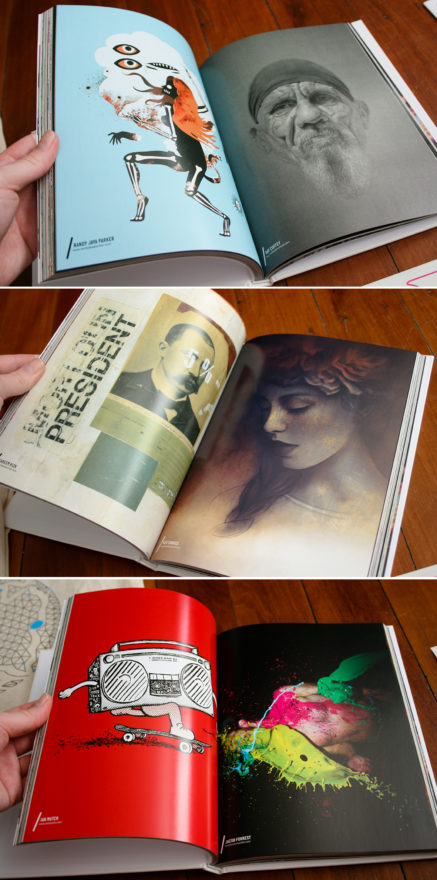
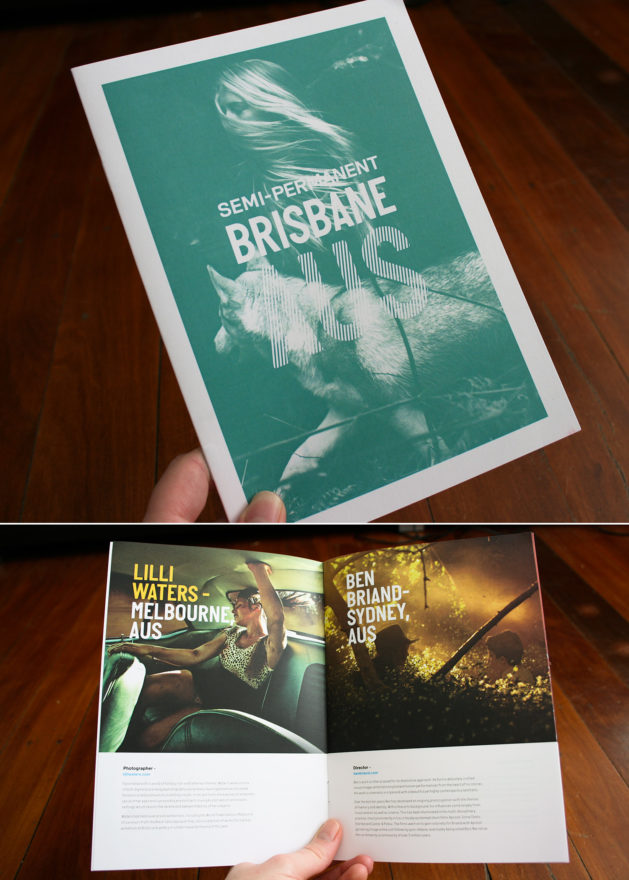
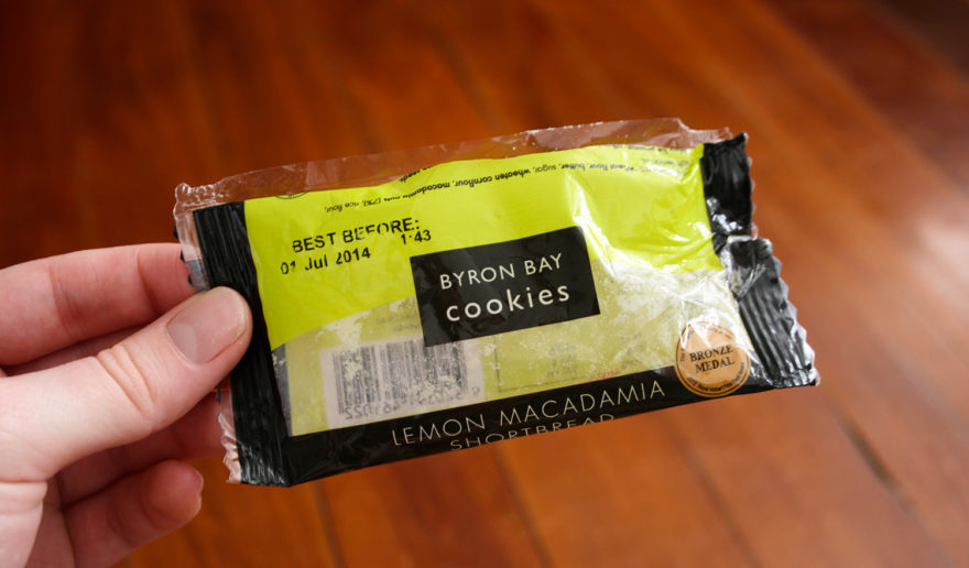
The SP Bag contained less than usual this year but I think that’s understandable considering the recent international conference additions that have happened this year. The usual SP book was of course included as well as small A5 program with speaker details and the schedule. My favourite item was a little packet of biscuits! Alas, mine got crushed during the day in the packet and we I tried to open them, the contents sprawled all over the kitchen so no cookies for me :(.
Looking forward to next year!

