The Sex, Drugs & Helvetica conference was back in Brisbane last month with another great line-up of creatives to share the highs, lows and everything in between of a selected project. The day was filled with interesting insights, sound advice and lots of laughs and I’m glad I got the chance to attend the conference once again.
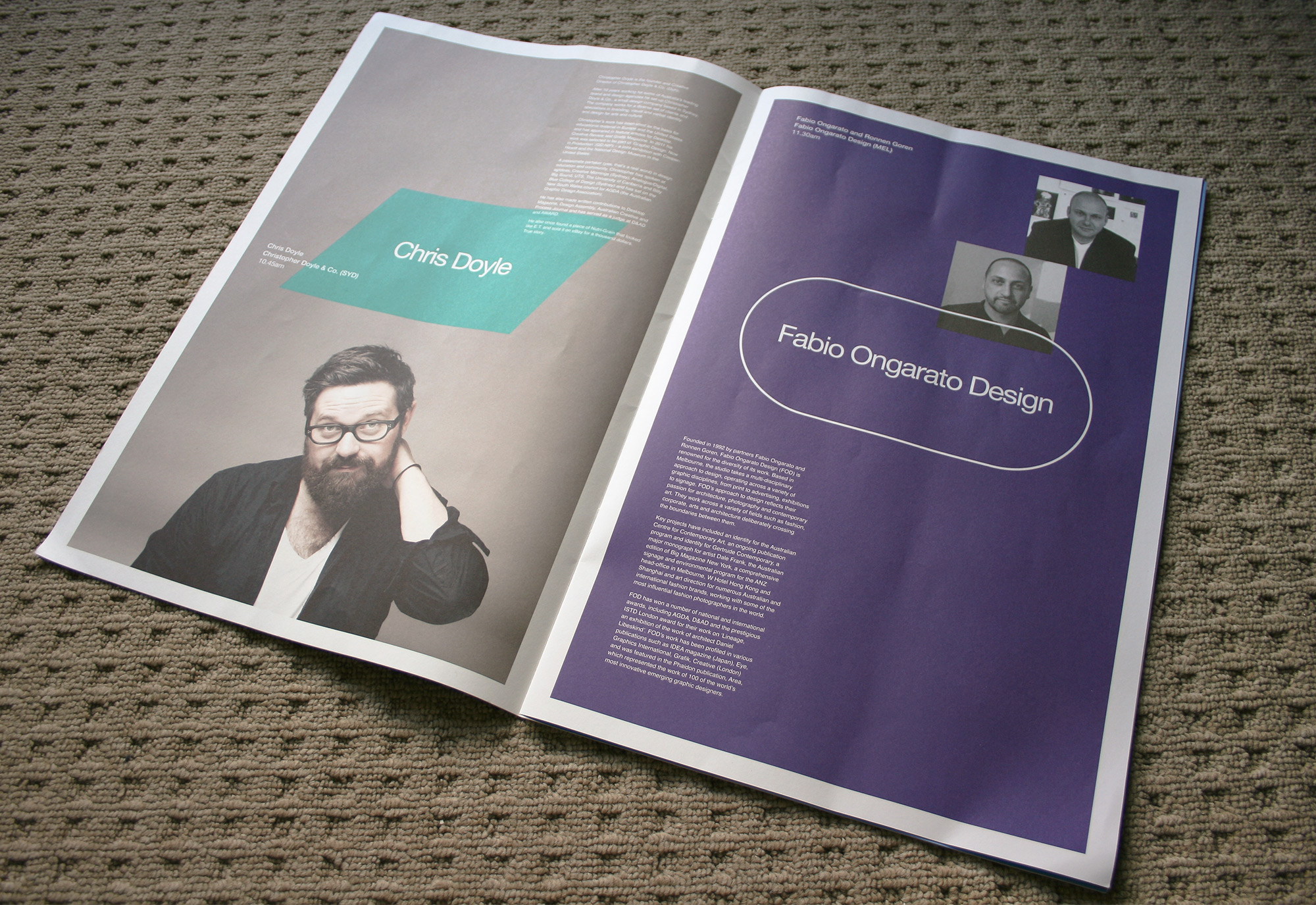
Chris Doyle – Christopher Doyle & Co.
First up was the quirky and cheerful yet unfortunately food poisoned Chris Doyle sharing his work for the Jezabels’ album release ‘The Brink’. The project itself came about through an old connection in the music industry that needed album artwork for “a young band with no money”. Working on a very low budget Doyle created the initial EP artwork that set the style, tone and overall brand of the band’s first album release. Years after their first collaboration, Doyle suddenly got a call out of the blue to do their next album artwork. With a brain dump over the phone from the lead singer as his brief, which I think is a great testament to the good relationship he’d built with the band, Doyle pulled themes together that created the basis for his first round of work.
He was kind enough to share the actual presentation document that discussed and rationalized his creative, noting the importance of the language in the copy. It walked through the bands artwork history, themes, elements, visual languages and the goals of the new release. After the presentation his work was delightfully approved but only a short week later that was no longer the case meaning he had to start over. After this knock back Doyle found himself somewhat directionless, working on different designs that weren’t right and trawling through sites for ideas. During one of these searches he came across a ‘random image’ that instantly struck him as the being the new album cover, sending it through to the band and manager who all really loved it. From here he sorted and selected other images from the same artist to create the final artwork for the album release and related materials.
Despite the quick and easy turn around the next morning he work up and asked ‘what have I done?’. Doyle found himself conflicted by the album artwork in that he had curated it, not created it and that it was more “art in response to art” than anything else. It’s interesting situation to consider – choosing an artwork that ‘feels’ right and whether this could be considered ‘designed’ when there was no real rationale behind it. I personally think that all the exploration of themes, visuals and tones in the lead up to finding that image helped inform his decision to choose it and that if he didn’t have such an insight into the band’s style he may have not considered it.
Fabio Ongarato & Ronnen Goren – Fabio Ongarato Design
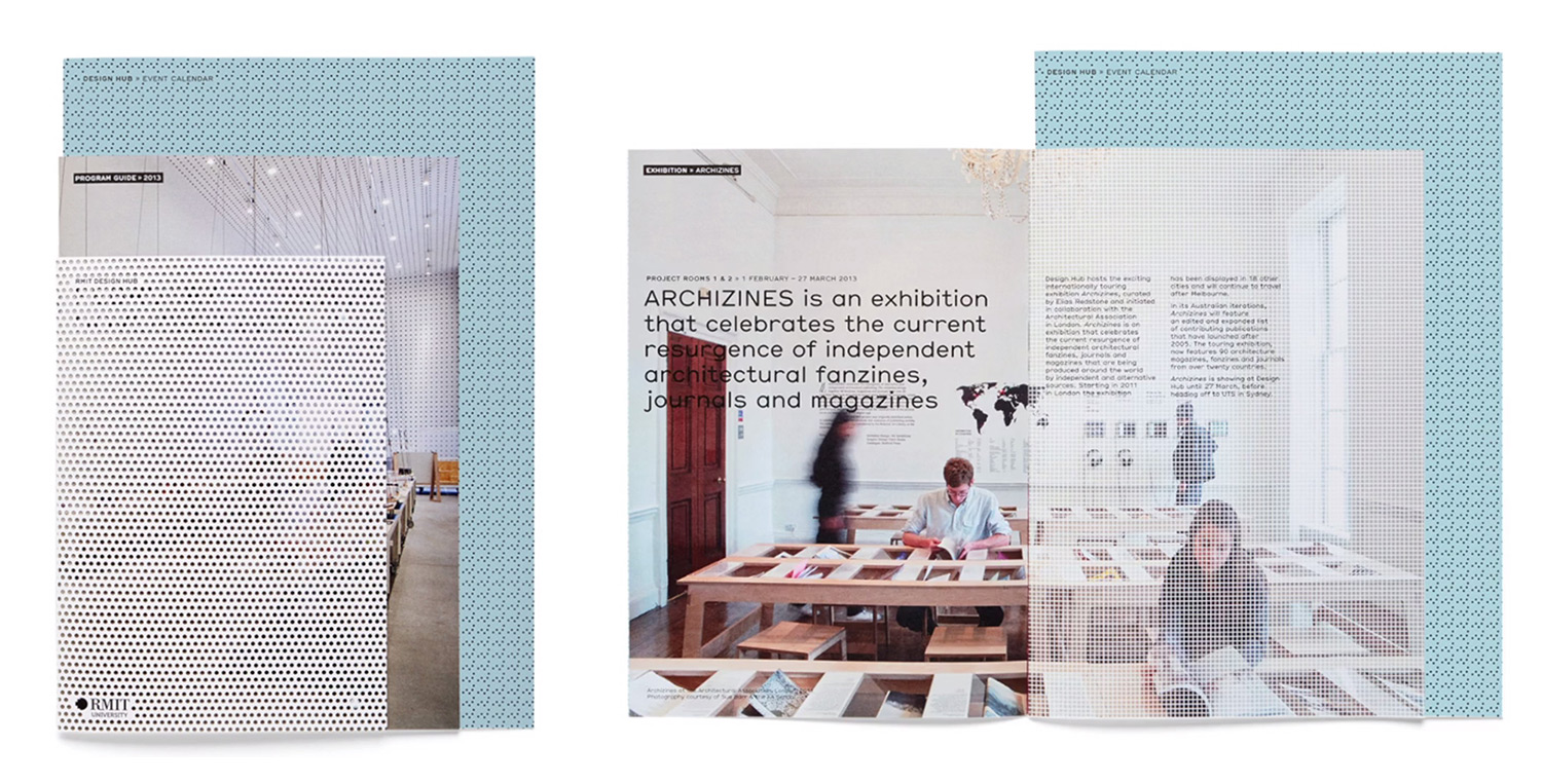
Our next speakers Fabio Ongarato & Ronnen Goren told us the great tale and battles of their project for the RMIT Design Hub. They were given a very detailed brief from the client, requiring a dynamic identity that would represent the building by using a low-fi aesthetic while also allowing the various exhibitions and shows to have their own identity alongside the Hub’s. Their pitch to the client provided a single option that encapsulated the spaces of the building by using screens and layers that hinted at the connections that flowed in and out of it. These screens were formed as patterns, drawing inspiration from the building’s materials, that were then overlaid over images or exhibition programmes, making the pattern the identity part of the design but also allowing the other brands to come through. The identity in turn was an identity system, not a logo with set colours and styles.
Only three days after the pitch they surprisingly received feedback from the client and while they expected changes they had actually totally nailed the brief. This seemed to be only easy part because there would be battles ahead to keep their design as it was. The work was in production when 2.5 months later, someone involved RMIT’s branding team who firmly told them that they would have to conform to the main branding style. The client thankfully was willing to fight for the designs while the team wrote their own defense for their ideas. After some time they were able to come to a solution that only had very minor alterations.
This was not the end of it though. Another conflict arose when they went to launch the website (which fun fact: was the first thing they designed for the identity) as RMIT was also having its own site redone. Again, they wanted the Design Hub’s site to also comply which the client and design team had to defend once again. In the process they were even betrayed by their own web designer who went and worked on the opposing site. Thankfully, they were also able to keep the web designs as they were and 1.8 years later, the identity of the RMIT Design Hub was finally released to the world. I think it’s pretty awesome that they were able to strongly fight against the big guys for their designs and win as I find this doesn’t always get to happen but as the guys put it – “strong ideas always win by rationale”.
Michaela Webb – Round
After our lunch break, we had Michaela Webb who discussed the process of creating the identity for Hotel Hotel. The project didn’t start out as one would expect with a pitch but instead as just a conversation about other designs and projects they liked, mainly exploring how they could create the tone for the hotel. As well as this they also explored the potential technology that visitors could use. To ensure they considered all touch points for this they created several visitor paths that showed how different personas would use the technology in different ways.
After some initial work the studio started writing the actual strategy of the project, creating themes from the earlier discussions with the client and selecting key themes that would be present in the work. The hotel wanted to change what a hotel could be and the idea of beg/borrow/steal came to mind – why should they create something when there was already so much out there. From this they starting gathering other hotel’s stationery, process drawings and papers from other studios that worked on the project, reusing the materials in variety of different ways. This included printing over them to make their own promotional items and stationery, recycling others to create the notepads for the hotel rooms and even stealing quotes about hotels from others to use as their own.
But then suddenly this was all paused after realising the potential legal complications this could being about. Some of the items they created also weren’t as eco-friendly as they intended to be once the costs were added up. The direction of the identity was reworked to use photography of the building in commercial materials but elements like the notepads and the quotes were rolled out throughout the hotel in various ways. Despite not entirely rolling out the designs as they fully intended, I believe they were still able to bring elements of those key themes established early on in the strategy and I think the final project worked out well!
Tim Buesing – Reactive
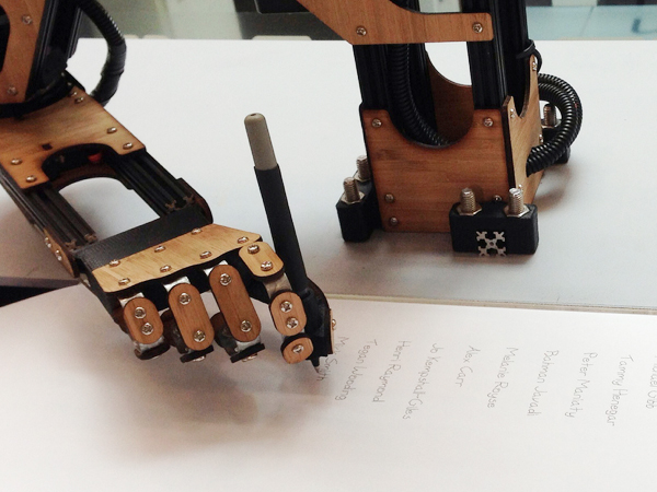
I thought this project was something quite special and I’m glad that Tim Buesing from Reactive decided to share it with us. The work was The Most Powerful Arm, a petition signing robot for raising awareness and funds for the disease Duchenne Muscular Dystrophy (DMD). The project was brought to the studio through the Save Our Sons charity organisation who needed to get over 20,000 signatures before the government to allow clinical trials for the disease in Australia. With a limited budget they decided they needed to utilize the power of social media to help spread the message.
Using technology they had played around with during Reactive’s research and development ‘D’ days, they created the idea of the most powerful arm that could write down petition signatures for participants. They used a DMD volunteer’s writing as the typeface for the signatures, taken from the last thing he wrote: a mother’s day card. There was a lot of the pre-launch preparations including not only creating the parts and technological features to support the campaign but also all the ‘making of’ videos and interviews that needed to be created with the launch. Some of these features included a live stream of the robot on the website and having a camera take a photograph of each signature which could then be shared by that signature’s owner on Facebook.
The campaign ended up bring a great success with lots of people signing the petition, generating media attention, raising awareness and most importantly getting over 20,000 signatures (32,049 by the end) to allow the petition to be shown in front of the government for consideration. As Brusing shared, it’s important to bring a human element into to the tech world to make people connect with it. I’m quite touched by this campaign (I got teary eyed watching the video about it) and I think it shows how powerful connecting with people through personal participation can be, especially with the capabilities of social media.
Kevin Finn – TheSumOf
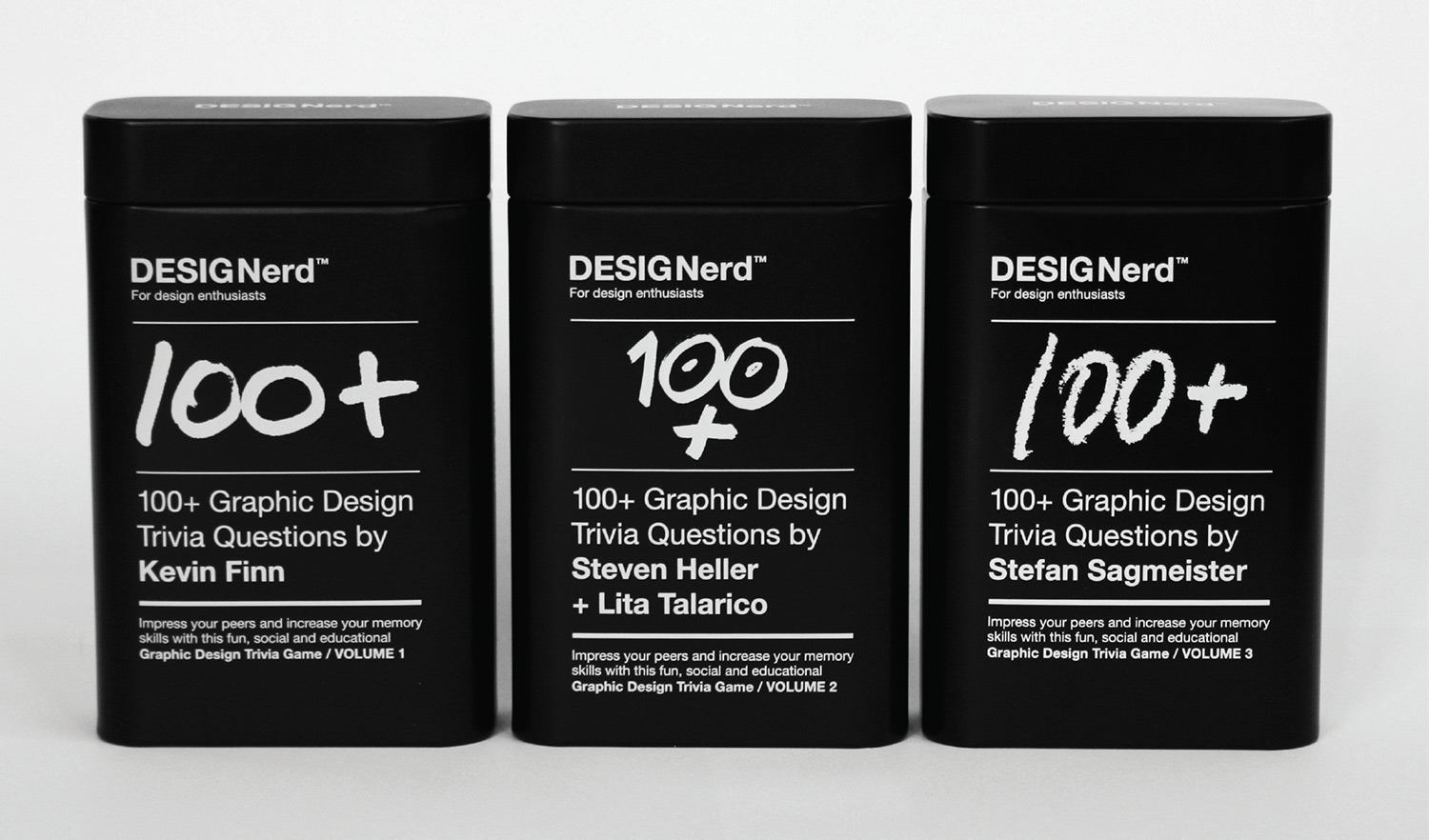
After the last project we had Kevin Finn discussing his own personal work for DESIGNerd. The beginning of this project started from a rooftop conversation with friends about their love for design knowledge which planted an idea in his mind to create something for people who liked this kind of trivia. He went home and created the DESIGNerd logo though it was some time before he knew what he wanted to do it. After some thinking he decided to turn it into a trivia game and fun educational tool, similar in style to Trivial Pursuit. Apart from creating his own 100 questions, he also asked other great designers to do their own questions which created two extra editions. The whole process from concept to launch took a whole year to complete.
Three days after launching he was endorsed on Fast Company and other sites which brought a lot of interest to the project. With the success of the trivia cards, Finn had great plans ahead for the game including a phone app version. He had just started work on when it had to be put on hold due to important life events. It made him really reassess the project and made him want to give it real value. After some time he started back on the app, something which he had never designed before. There was a lot of experimenting with the design which included testing, giving feedback and revising the work. Unfortunately harder life events caused everything to fall to the wayside for a while Finn dealt with it, again putting the app on hold. The project did eventually get finished though, with the app finally released on the iPhone.
Despite having trouble contacting sites to help promote the project, lots of the top designers absolutely loved and shared their enthusiasm for the app. Finn noted that sometimes you need people to tell you your work is good and has value to feel validation for all the effort you put into a project, something I think nearly every designer secretly wants. Finn learned many lessons from building DESIGNerd in that while design is everything, it can blind you to ignore other important things like costs and budgets. He also commented on the fact that it was vital to build relationships and create value from your projects because sometimes working on them on your own takes a lot of belief in the idea. I personally wasn’t sure of Kevin Finn work at first because I found him to be a bit full of himself (if you are Kevin Finn, I’m really sorry I ever thought this of you!) but after seeing him talking in person about this project I realised his passion for it and understood his thinking around it. I really want to get a hold of this game now. If only I had an iPhone.
Michael C Place – Build
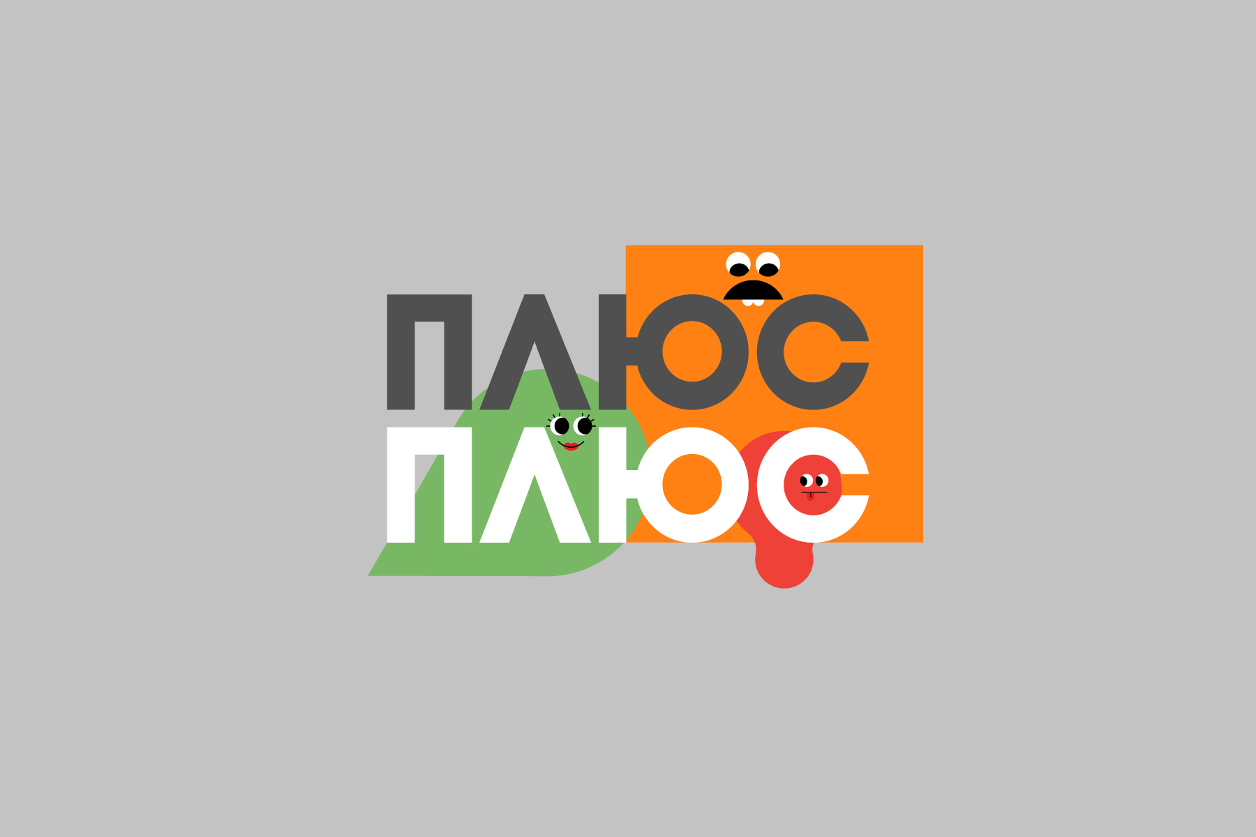
Our final speaker of the day was Michael C Place from Build sharing the great tale of how their branding project for the PlusPlus TV channel came to be. This project had some very stressful moments around it, mainly due to mis-communications with the client. The project started with looking at illustrations of a referred artist and picking out elements that they liked, mainly focusing on those with simple colour schemes. From these they created cute characters that were based off simple shapes with bright colours. The characters were then put together in various applications and sent for the first round of client approval.
Unfortunately the client didn’t like the designs, thinking they were uninspired and noting the applications were print based when this was for a TV channel. The logo should have also been in Ukrainian, not English. With only the characters themselves approved they went back to the drawing board, starting with the logo. This was an interesting part of the design as they had never worked with the unique letters of the Ukrainian language but after some experimenting they found a style they liked and thankfully the client also approved. They then started to integrate the logo and characters together in various lockups while also mixing different characters shapes to create a diverse range of shape ‘families’. Build also worked a lot on the typography of the brand font with subtle changes to letters to make easier reading. Place noted that these details were important, stating a Build motto of “it’ll do, won’t do”. With all of these elements coming together, they created a system to how the copy and the characters were supposed to be laid out and displayed.
With the ball now rolling on the project, they started work on the animations. Storyboard ideas were approved and they created small teasers that included the characters in various shots of the Ukraine while also making ‘idents’ that had quirky little character adventures before revealing the logo (definitely check them out, they’re quite cute and funny). With all the work done, the final piece was to hand over the identity to the company to use which meant creating some extensive guidelines that noted all the systems they had used in their work. Despite all the difficulties along the way to get designs approved and completed, the final identity came out quite well and can used for some time to come. I think this was my favourite work of the day but I’m biased towards bold colours and cute characters :P. It goes to show that it doesn’t matter if an agency is big or small, well-known and respected or barely known at all, problems with clients happen to all of us.
Conference Loot
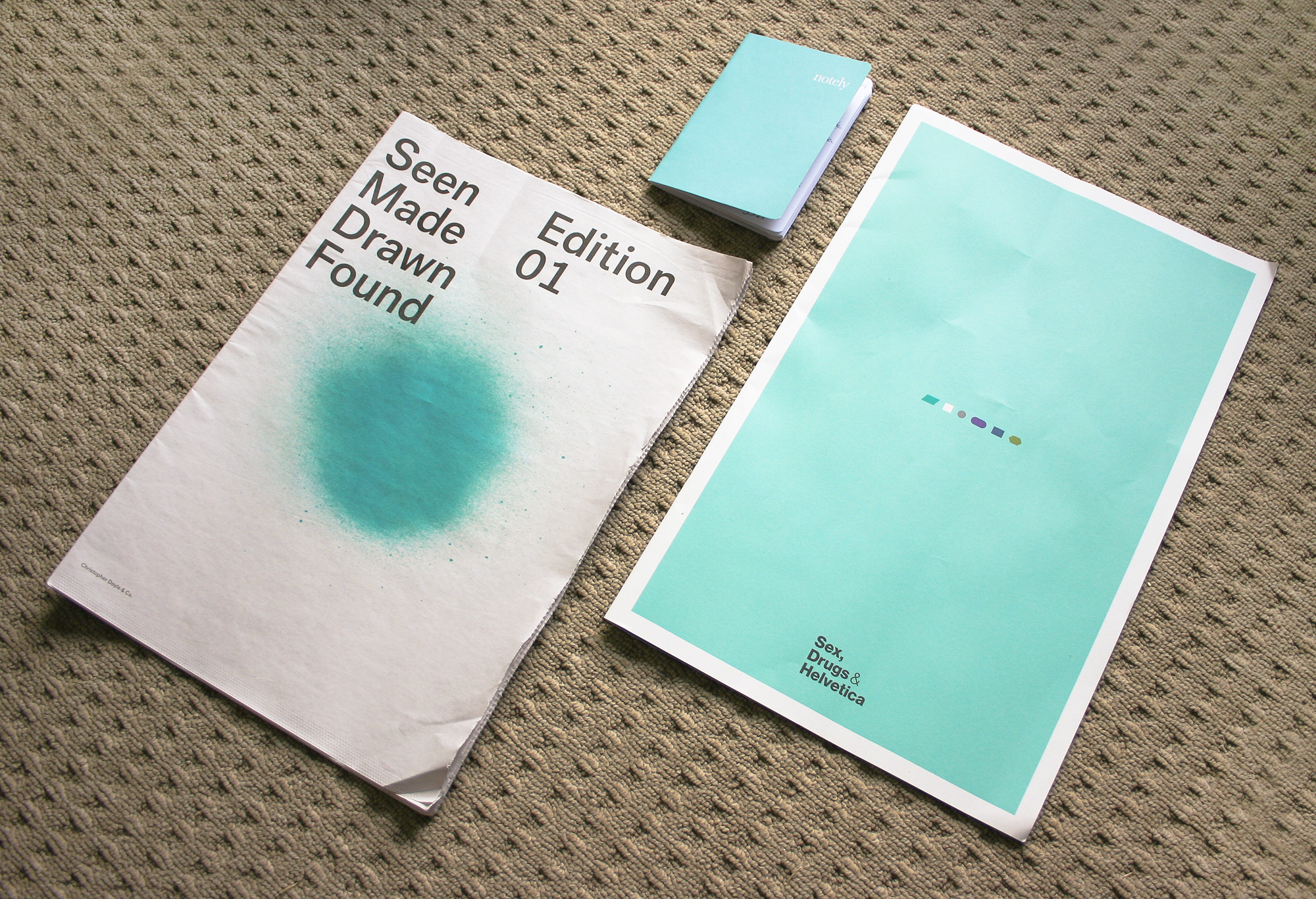
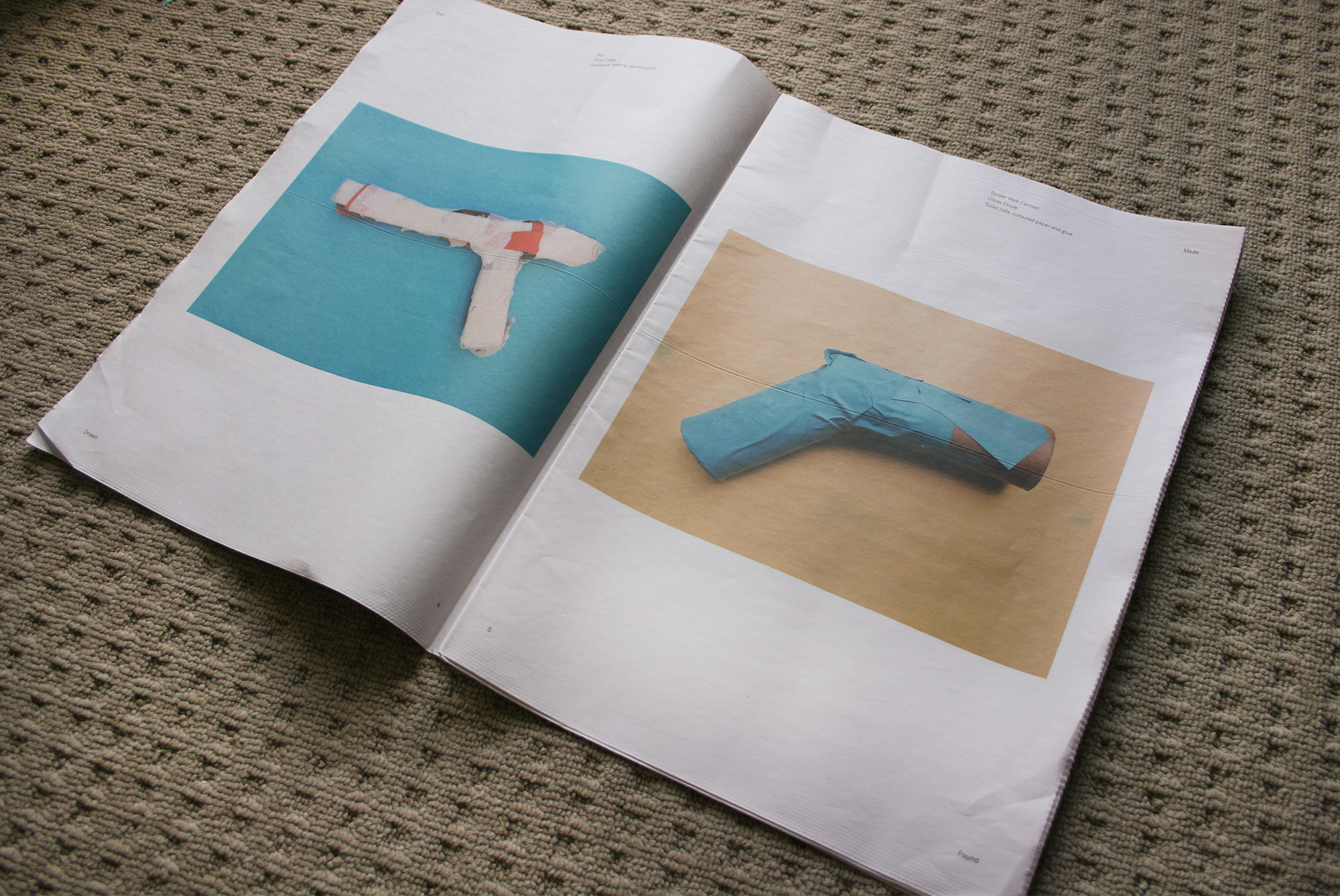
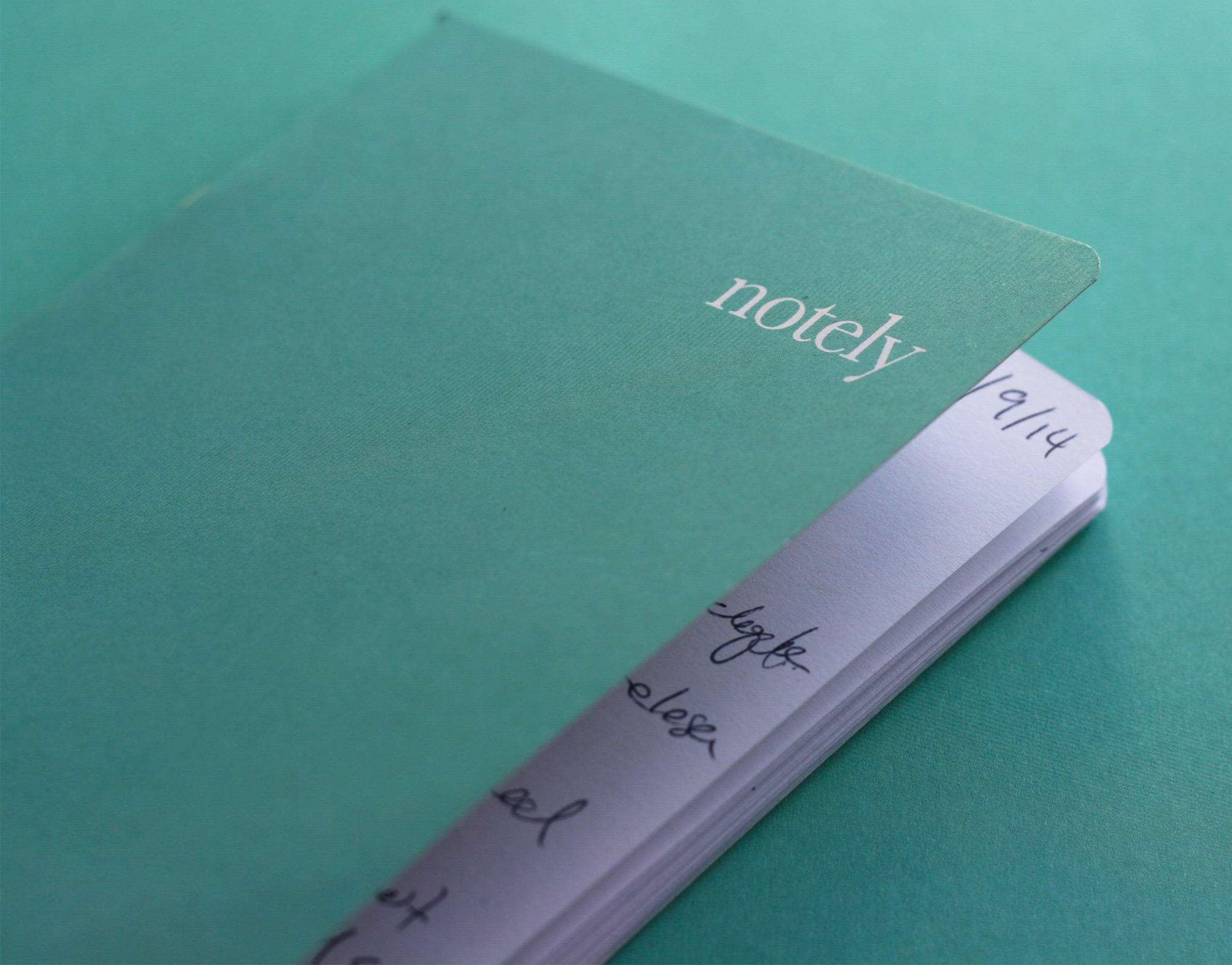
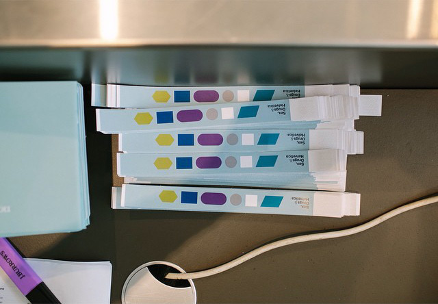
What is a conference without conference loot! This time along with the large format booklet containing times, speaker info and such, we received a small notely notepad at registration which I gladly filled with all my scribbly notes from the day. A copy of Christopher Doyle’s Seen, Made, Drawn, Found paper was also handed out that includes various small creations from himself and his son. My favourite thing though was the wrist paper bands that were actually SD&H branded. First time I’ve ever seen that at conference (its the little things!).
I think this years conference was even better than the last years with lots of industry insights as well as laughs throughout the day. Looking forward to next years for sure. The SD&H crew have also done their own recap of the conference on their blog which you should check out as well.