
I want to start off by saying sorry for the lack of posts lately. What should have been a simple LCD screen replacement turned into 2 weeks without a laptop due to broken motherboard. So here is the post I intended on finishing about 2 weeks ago before everything hit the fan, enjoy ;).
So I want to tell you guys about a little on and off project I’ve been working on over the past couple of months. There were moments of triumph as well as frustrating problems but at the start of September, I released my new Portfolio onto the web!
I wanted my new portfolio to achieve 2 things with the new designs –
- Be able to more effectively track people’s navigation through the website and
- Try and make the site have a responsive design.
Optimising for site tracking
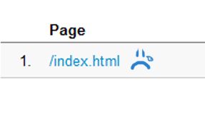
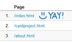
My old design was a one page website released it back in 2009 when I didn’t have a lot of designs to show off (I was just about to graduate). Then I discovered the wonders of Google Analytics. I copied and pasted that tracking code at lighting speed and then routinely checked the stats. Unfortunately, I came to realise that I couldn’t accurately track what people were viewing because all my portfolio images were within jQuery Lightboxes. Because of lack of click throughs to other pages, the only thing listed in Analytics was the index.html, which was a sorry site to see.
The limitation with the jQuery Lightbox also meant I could only show so much within a certain image size (800px high from memory, so people on smaller screens didn’t have to scroll). I felt Icouldn’t really show off a whole project of work that extended across multiple mediums with this space. It was time for a new design.
I decided that each client/project would sit on it’s own page with the ability to scroll through multiple images that highlighted its different implementations and design. The dedicated pages also meant I could include a explanation discussing the choices and creative direction of each project.
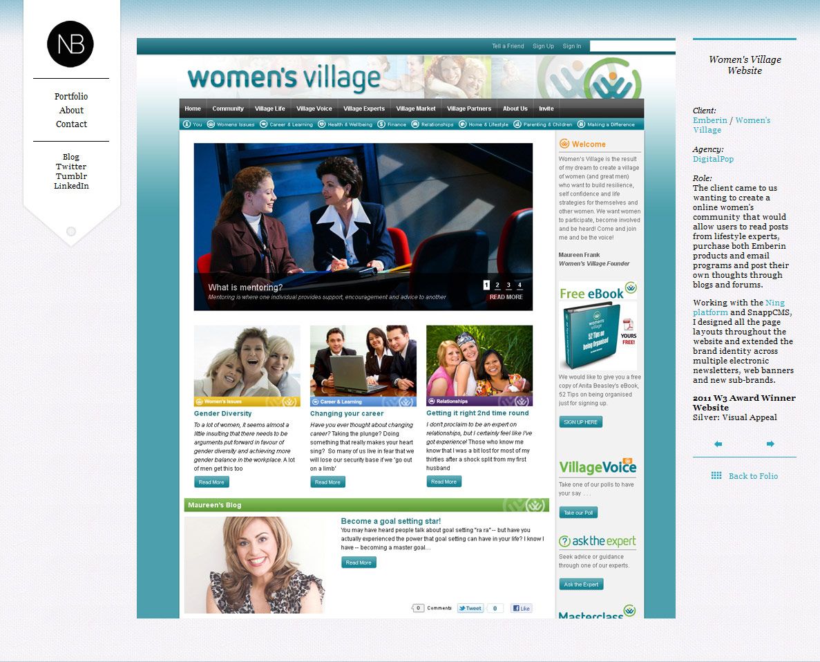
Because each project was now separated, I could also see how much traffic and how users navigated on the site more accurately as well as what pages were getting the most interest. The site has been up since the 1st of September and so far – the Card Project is the most viewed!
Responsive Web Design
The second goal I wanted to achieve was a responsive website that could be viewed easily across multiple screen resolutions. I’d never played around with this before and wanted to see if I could do it. The design uses media queries which I managed to integrate with a some trial and error. Each page has two stylesheets with one containing all of the media queries for various resolutions.
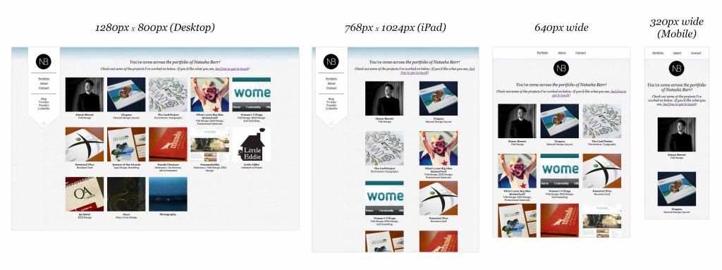
Apart from the main homepage, the images scale with the browser size and content will slot under each other as the resolution gets smaller. The design changes slightly around 640px, changing to display the navigation across the top of the screen with the logo underneath followed by the main body content.
This method works across most browsers except for, of course, internet explorer, which has a more standard version of the site after a certain resolution.
Design in General
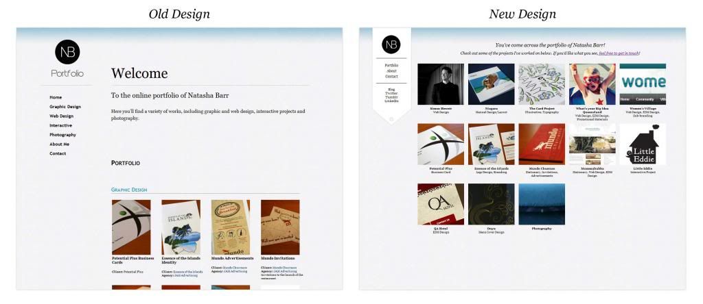
The overall design style is similar to what I has before. I kept the textured background with the blue highlight across the top and I’ve used the same blue for borders found around the content here and there.
I wanted to keep the navigation really short and narrowed down what pages I really needed. The home page is the portfolio so the link is, therefore, just ‘Portfolio’. I’ve been wondering if I should just change it to home though (note in the comments what you think!). Apart from the individual project pages, the only other links are the About and Contact page, the latter having an actual form instead just my email listed in the content. All the other links are to external social and professional accounts.
I’m happy with how the site has turned out though now that I started looking at other peoples designs I want to update already -_-. At least now I feel I can build upon and evolve this current version compared to the last so expect changes as time goes on ^_^.
Let me know what you think about the new design the comments and let me know if you find any bugs!
Keep the good work, I like your design.
Terrence Rocha
Terrence Rocha