Japan is a place that I know many designers and non-designers alike are fascinated by. Whether it’s the history, the culture and subsequent sub-cultures, the novelties or just the food, Japan has something to interest everybody. During my trip my May I couldn’t help but observe Japan’s approach to design and advertising. I also got to experience using some Japanese websites before the trip and noticed distinct differences in style and functionality.
Over the next two posts I will not only be looking at design of Japanese media but also Japan’s technology use and online behaviour in comparison to our own.
Design
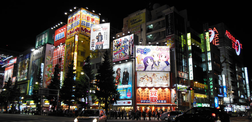
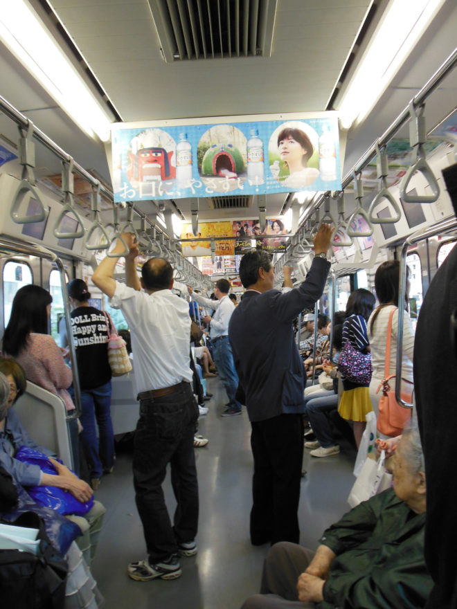
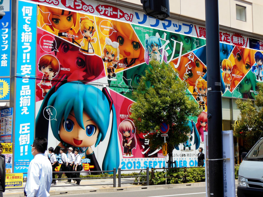
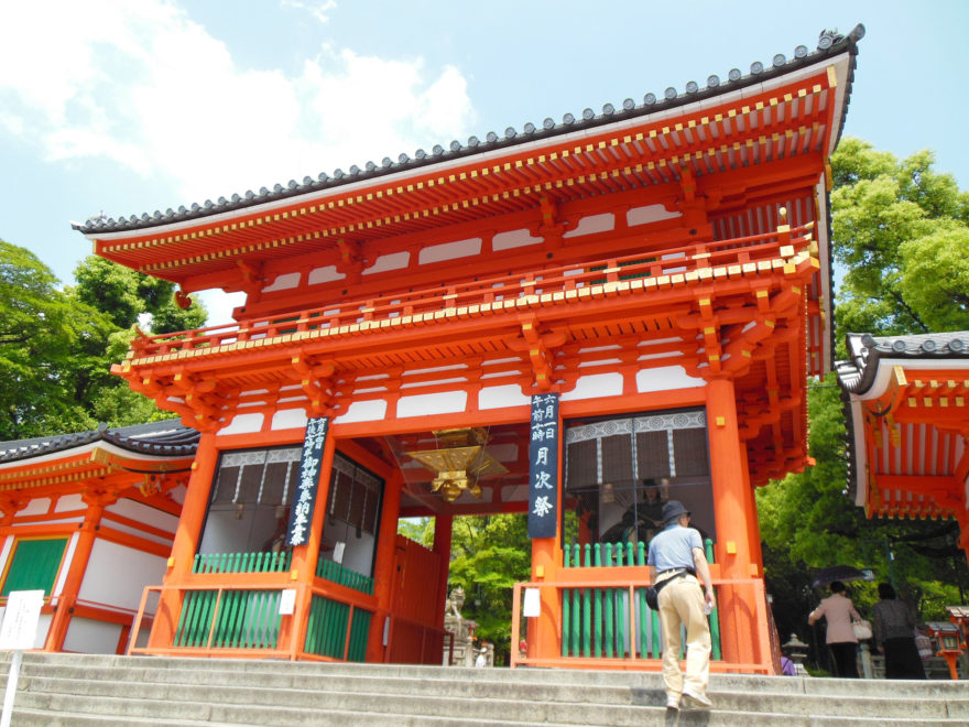
When you arrive in Japan you can’t help but notice the differences in Japanese advertising and design. For starters, it’s everywhere and takes up a lot more visual space than what you’d experiencd in Australia. Large decals and billboards on the sides of buildings, decorated exteriors of trains with advertising on the carriage’s interior, even tissues given out on the street have a promotions printed on the packets.
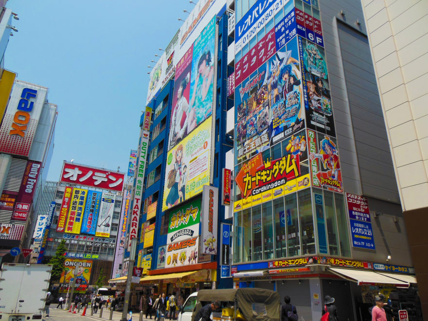
From my own exposure to Japanese media, I feel that there are three main types of execution ‘styles’ – those that are traditional, those that are cool and finally those that are ‘kawaii/quirky’. There are of course other types but I feel these styles cover the broad majority of them.
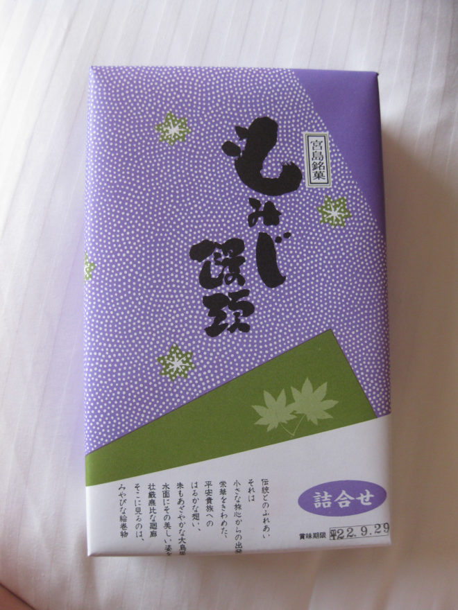
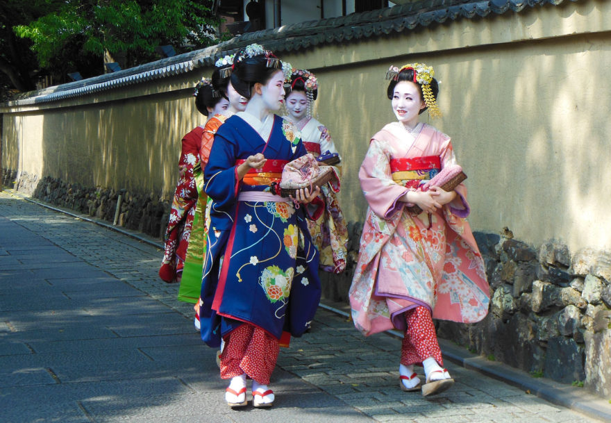
Traditional is usually advertising and design centered around products or services that have some sort of cultural ties in Japan. This includes packaging of traditional foods and advertisements showing the process of something being made or produced.
Cool is probably the style we are most familiar with because we use it for most of our own advertising. Think of men’s shaving ads or car commercials – they look sleek and refined and make you want to buy them. There’s also the other type of ‘cool’ that has a fun element. The Google ad below is a good example.
The third style – kawaii/quirky – I believe is pretty unique to Japan. Most people have been sent some type of weird Japanese commercial that plays with this type of style. But where does it come from?
Origins of the Kawaii style
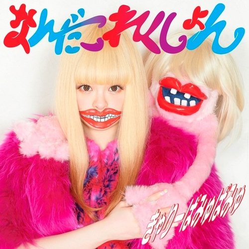
The aesthetics of ‘kawaii’ are usually cute, quirky and youthful. It’s believed that kawaii grew out of the 70’s when high school students started writing with rounded letters and cute symbols, which became such a problem that it was actually banned in some schools. As this type of writing style grew rife, the growth of adults acting out in childlike ways with vulnerable mannerisms also increased, slowly evolving into the state of almost everything having some element of this kawaii style as it’s seen today.
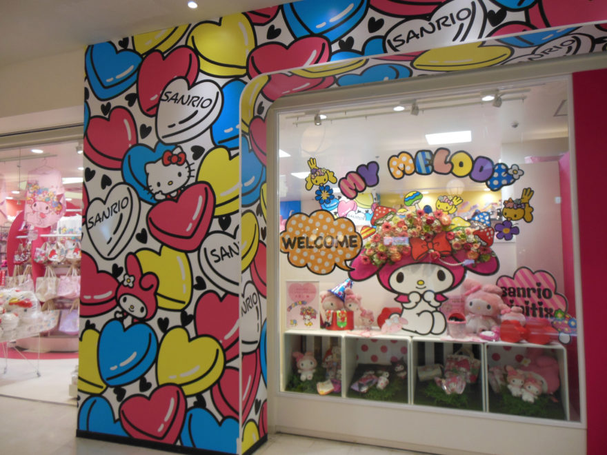
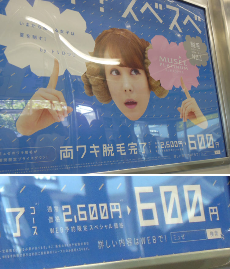
While the word kawaii means cute in Japanese, it has a lot more cultural undertones and meaning to it than just being a descriptive word. In fact, it has almost taken precedence over the Japanese aesthetics of beautiful and refined, especially for young people. When you’re in Japan you can’t escape the kawaii invasion – products are covered with colourful pictures and text. Advertisements, magazines and promotions use kawaii aesthetic treatments, cute characters are featured on almost anything you can imagine and games also take inspiration from the style (just think of Nintendo titles). Even barcodes can be stylised to be more appealing!
But this isn’t just something that young tween girls are interested in. In fact many women and even men can been seen with little cute phone charms or hand washers when out and about. But why is the kawaii aesthetic loved so much? It’s believed that may be a symptom of Japanese adult life. Unlike in other countries where adulthood is usually tied in with freedom and fun, Japanese adulthood is filled with responsibilities a person holds with their family and workplace. This breeds a non-assertion mentality which is part of Japan’s collectivist cultural values. Outside of these responsibilities and non-assertion, Japanese also have separate ‘face’ that is their true self. It’s believed that kawaii products and culture in fact help bridge the gap between a person’s two faces, allowing them to feel a part of group – whether it’s to a particular character or just the kawaii style in general.
Aesthetics
Colours
The Japanese love using colour and it plays an important part of their design aesthetics and history. Many advertisements feature a spectrum of bold and rich colours or will theme it around one colour, usually a shade of pink.
While this is in part a reaction to over saturation of media, I believe it’s also a more cultural one. The Japanese have historically always incorporated colour into their fashion and arts. Just visit a local shrine and see their beautiful red torii gates or look at the variety of colours included in a kimono. Colour is a lot more symbolic and entwined than it is in Australia, where it is usually only incorporated at select times and events e.g supporting for a sports team.
Typography
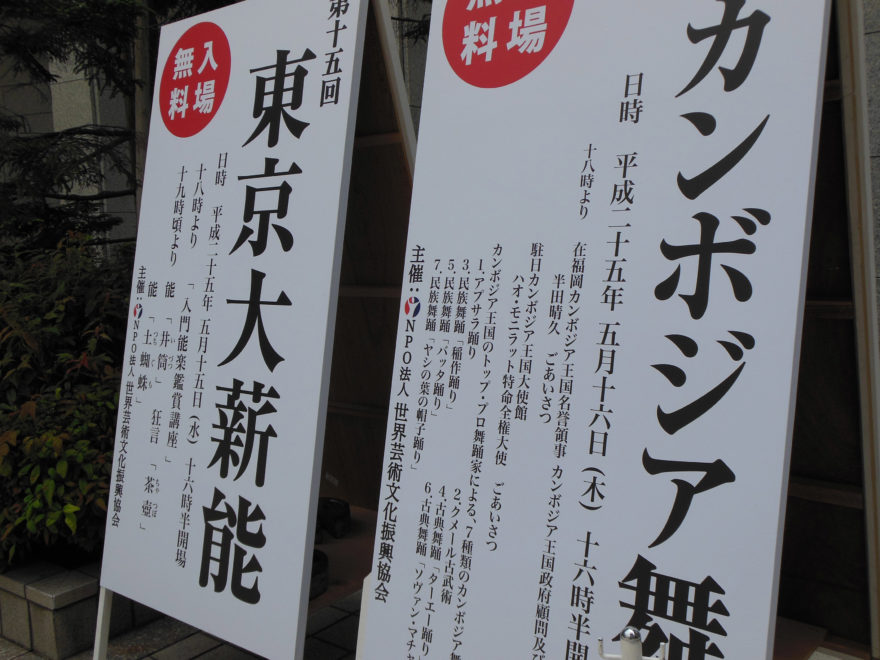
Japanese typography is an interesting one because when looking at a lot of promotional materials it may seem there isn’t much to work with. There are two main types – mincho and gothic typefaces. Mincho typefaces are pretty much the serif typefaces of Japan. The strokes include the small flicks on the ends you often see in calligraphy lettering (though the final characters are more modern interpretations). The other type is gothic typefaces which are equivalent to our sans-serif fonts for the same reasons. From these two main types there are many different varieties that combine or add new elements – humble bunny design explains some of these in more detail here.
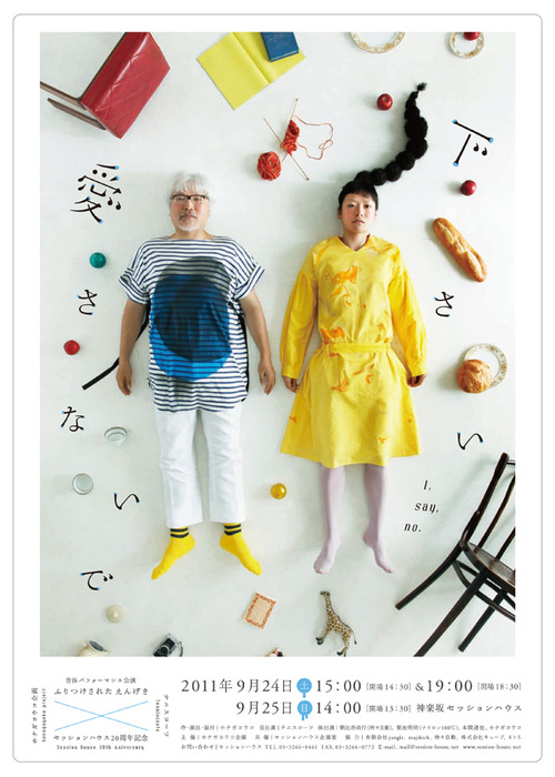
One thing Japan has over us is the ability to vertically display text in their designs. While such a practice in western design is usually not encouraged, Japanese text is natively displayed vertically, which can make for some interesting layout choices.
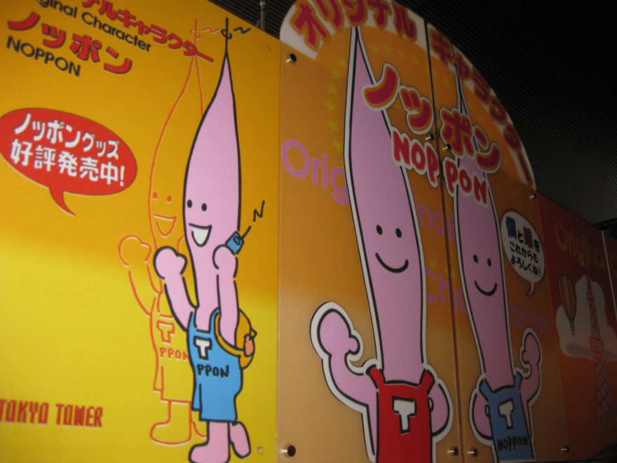
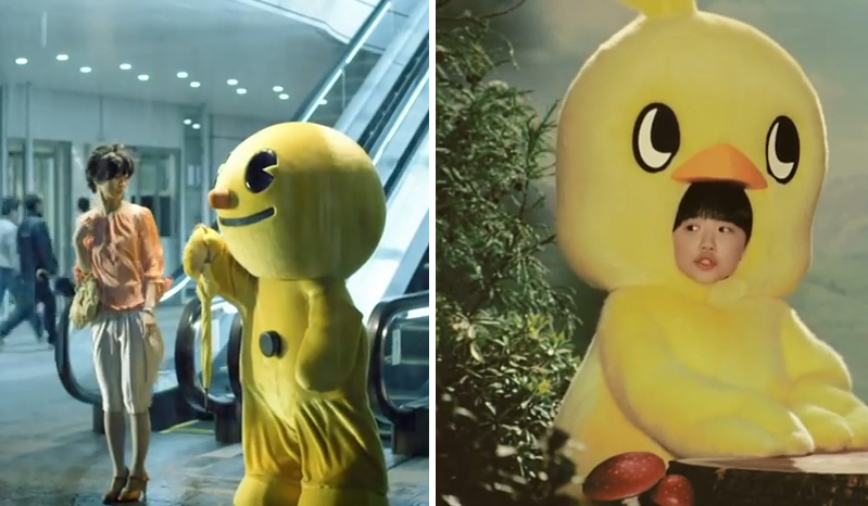
Mascots, mascots everywhere
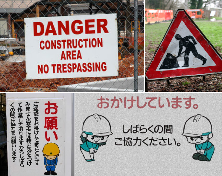
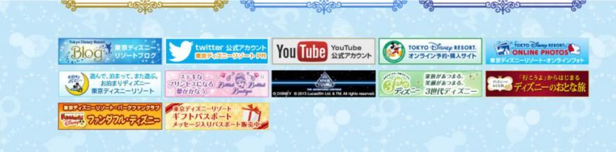
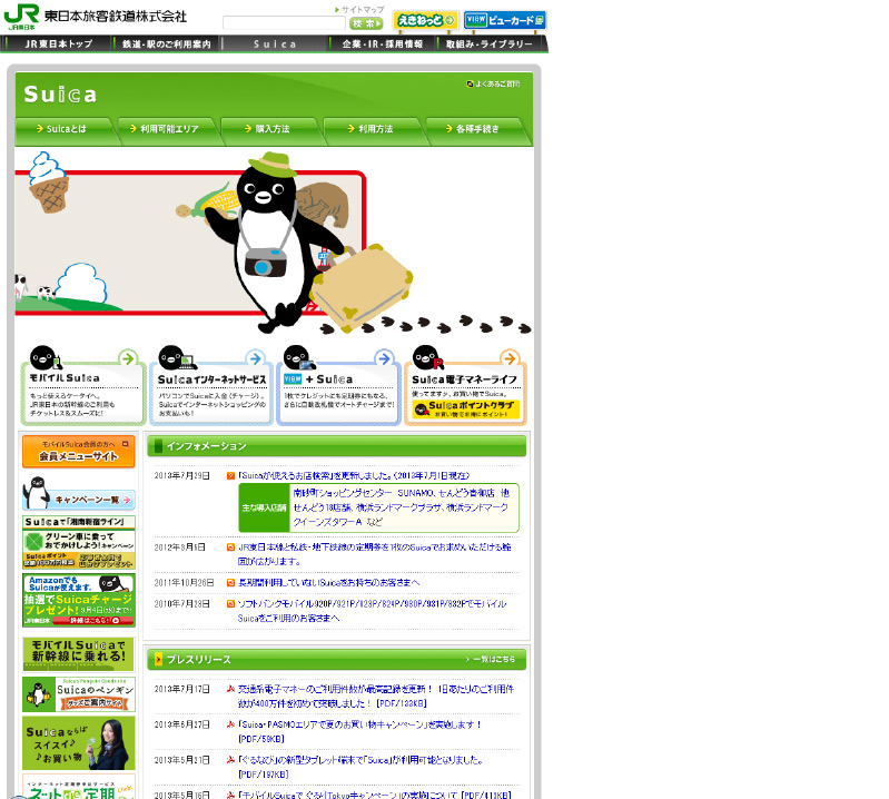
Another element of design you’ll notice are mascots. These cute creatures and characters are not just for hello kitty franchises but are actually much more widespread. Specific products such as Windows’ OS releases have their own mascot, police departments and construction areas are known to use mascots on their signage. Particular towns and sometimes even shrines have their own little cute representatives. Having these mascots for places and businesses is known to give them a more friendly face.
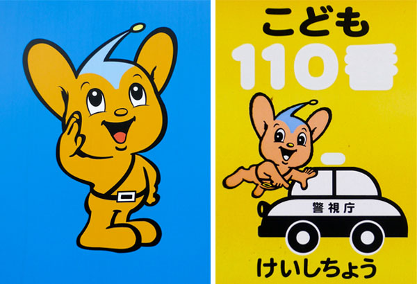
Cute characters are also used in ad hoc ways for PSAs and important signage. This is apparently due to cute characters making information more easier to process. Consider the signage seen surrounding construction areas. It’s usually strict with copy like ‘authorised person’s only’ – bluntly telling you to keep the hell away from the area. These types of signs typically come across as quite harsh and impersonal. Consider instead a small character telling you this information, appearing much more friendly and personal. At the end of the day, the latter signage is a lot less jarring to read and understand.
Old terminology
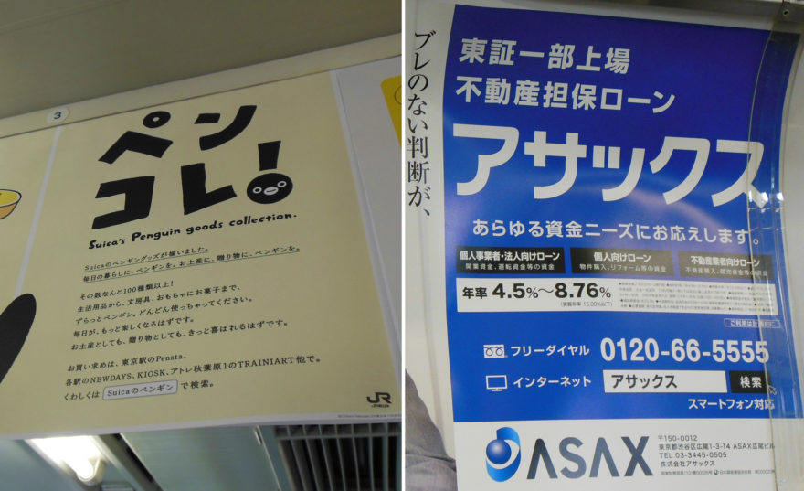
One thing I found interesting about Japan was its use of certain words for particular descriptions or details. An example of this is the use of ‘TEL’ instead of ‘Phone’ or ‘P’ when referring to a number to call. The word Telephone is a somewhat old to use since it refers more to a landline connection when Japan uses mobile phones more. I’ve also saw others such as ‘Free Dial’ as opposed to ‘Free call’. My guess that this is probably due to Japan catering for their large older generation as well as their slow uptake of certain technological progressions.
Symbols
Japan uses some unique symbols of its own which you may be unfamiliar with. An example of this is the symbol for post office and/or post box number for a particular address – it looks like this – 〒. Another interesting one is this symbol below.
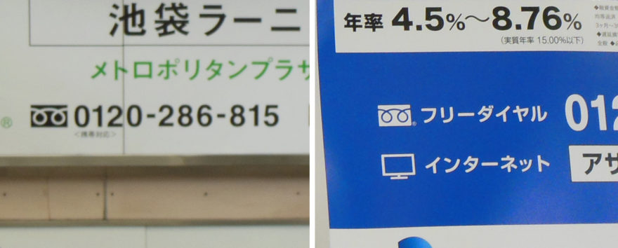
If you see this symbol in front of a telephone number, it’s means it’s a free call (or as I discussed before, ‘Free Dial’). Finally there’s this symbol – ※ – that I’ve noticed a lot, not so much as a representative icon but more as a highlighter of information or a bullet point.
Additional design elements
Something I’d never seen before in Japan was the introduction of a search bar as a call to action. This included an actual representation of a search bar with a suggested search term (usually the brand or campaign name). I saw this device used in both print and TVC advertising across a variety of different promotions. At first I found it interesting that they would risk their website not appearing first in a search engine but maybe there’s some good SEO at play here. One of the reasons for this type of call to action is apparently due to the rising ageing population who may need a bit more prompting to search for a product. My only problem with this is that they sometimes display the search bar graphic so small that they can be hard to spot amongst all the clutter.
As a side note, I’ve also noticed that S.M Entertainment uses in-video search bar promotions in their K-pop videos for the app Genie. Honda also ran TVCs in Australia that included a search bar at the end. Is this becoming a trend?
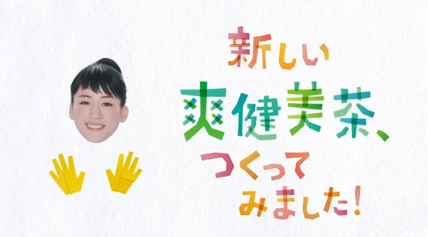
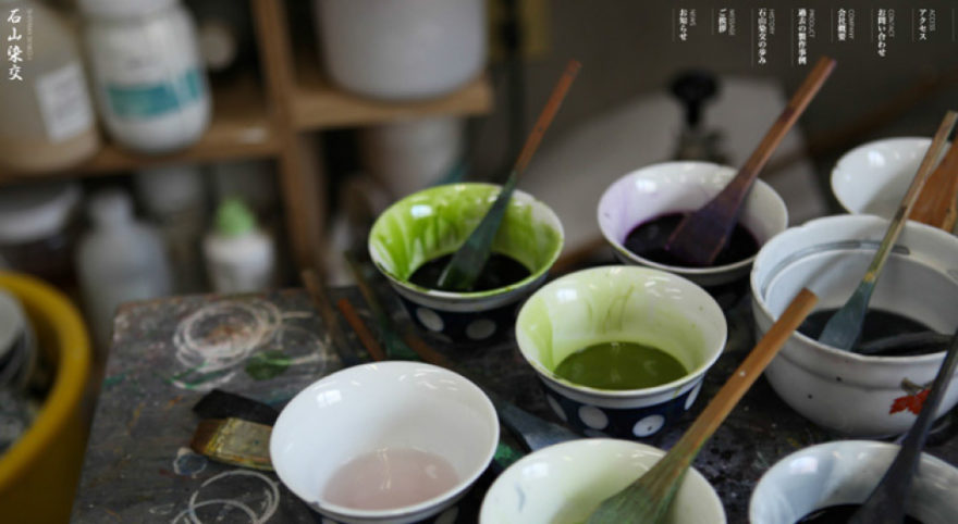
Handmade/tangible aesthetic
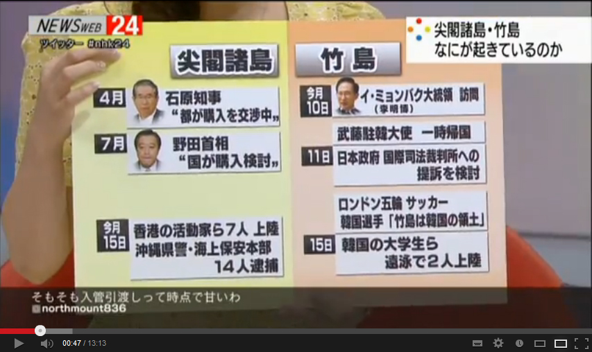
This is something I’ve noticed across a lot of media and that’s the choice of using tangible graphics or items. This can be anything from items photographed together for posters, having people dressed up in costumes or even showing infographics on boards on the news. The last example shows a difference in approach when compared to our own because usually information on news shows is displayed digitally on a large screen compared to the small boards that the Japanese will hold up themselves. I wonder how much time the creator of these board graphics has to turn them around!
Overly optimistic mood
While reviewing Japanese advertising, a common theme of overly optimistic and happy people becomes pretty apparent. Lots of singing and dancing and big smiles. Japanese culture has a homogeneous nature where keeping everything in balance and not making people uncomfortable is important so this style may be catering for these values.
Another reason is that a lot of products are promoted mostly on emotions and feelings instead of promoting benefits. It’s been found that the Japanese prefer this selling of emotions because it doesn’t come off as being competitive. You’ll see this especially with Japanese TVCs that are fun and light-hearted.
A good way to see examples of this is on the YouTube channel JPCMHD which often collates new TV ads from Japan.
In the Online Space
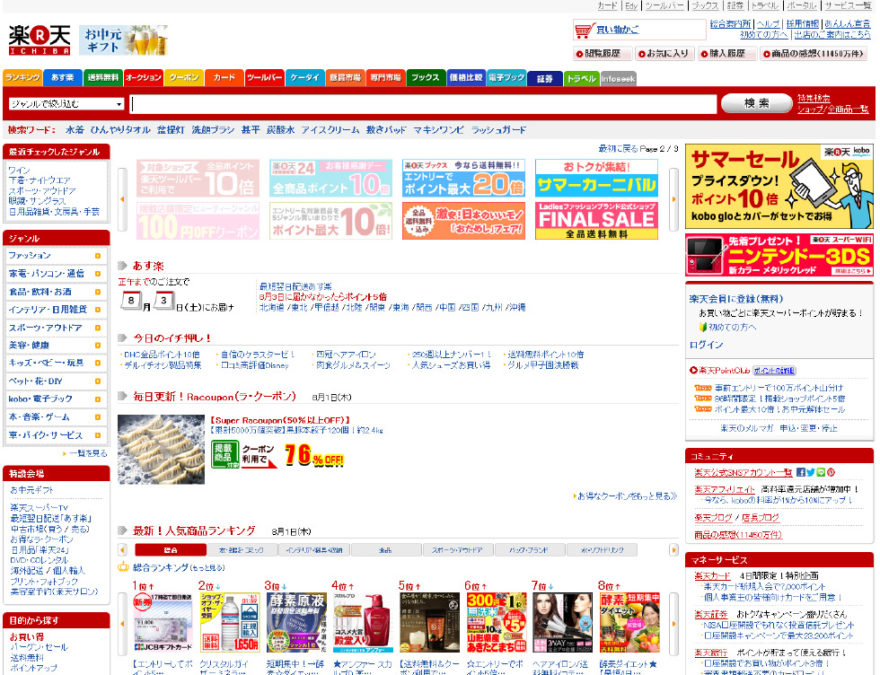
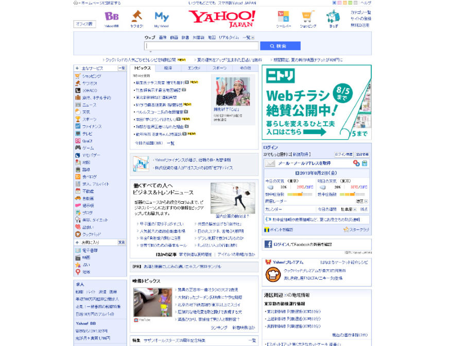
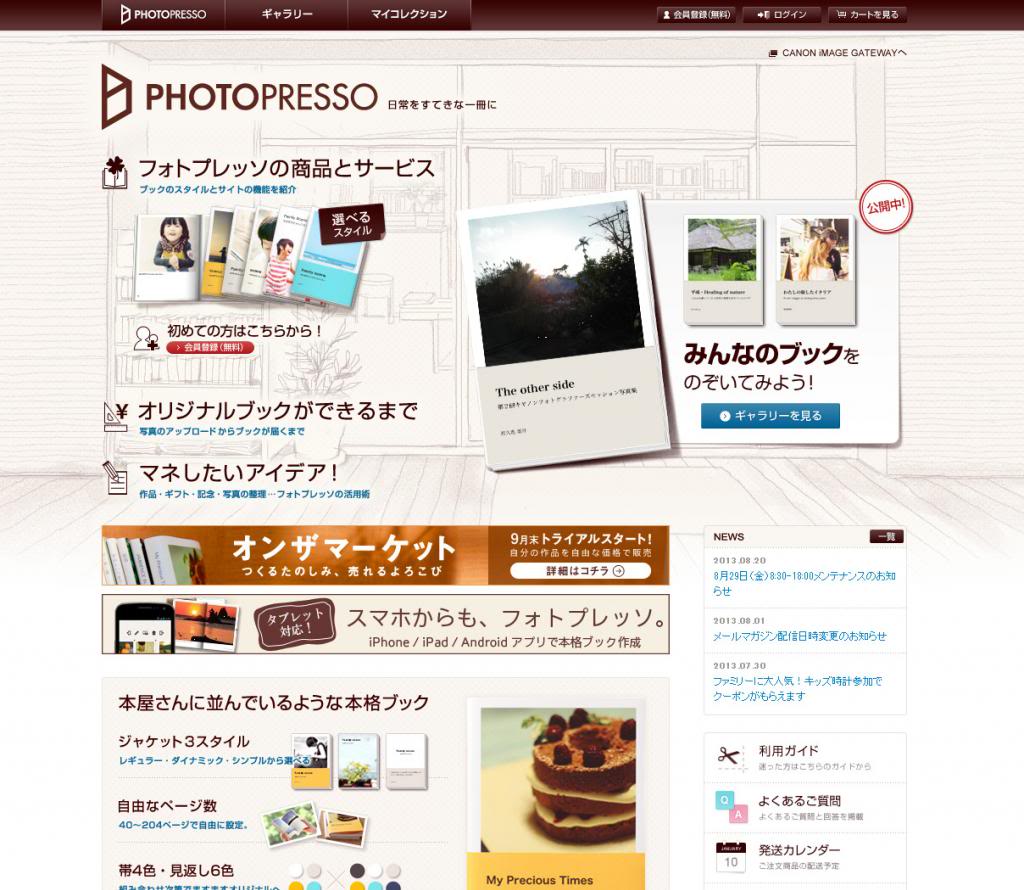
So how have all these design elements been interpreted for online media? It’s interesting to see how some elements have been incorporated but not others. I find many sites are not as liberal with their use of colour as they are in other media, with most designs just sitting on while backgrounds with highlights of colour here and there, except in the case of promotional banners. These banners are where you’ll usually find a companies mascot being incorporated.
Typography is a more restricted online (as it is for most of us). The Japanese alphabet struggles with perceptive grey online and it’s nearly impossible to correct the spacing. This is why it doesn’t surprise me that a lot of headings on website sections are actually images instead of live text. It’s also almost impossible to display text vertically online so it rarely included or it’s part of an image.
Additional digital aesthetics
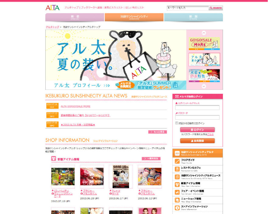
One common element in Japanese sites is the use of small spotlights that are usually located somewhere on the homepage. They appear to promote a variety of different items depending on what site they’re on from company promotions, cross-promotions, special offers and even links out to other associated sites. They’re always quite small and there’s always 3 or 4 of them listed together.
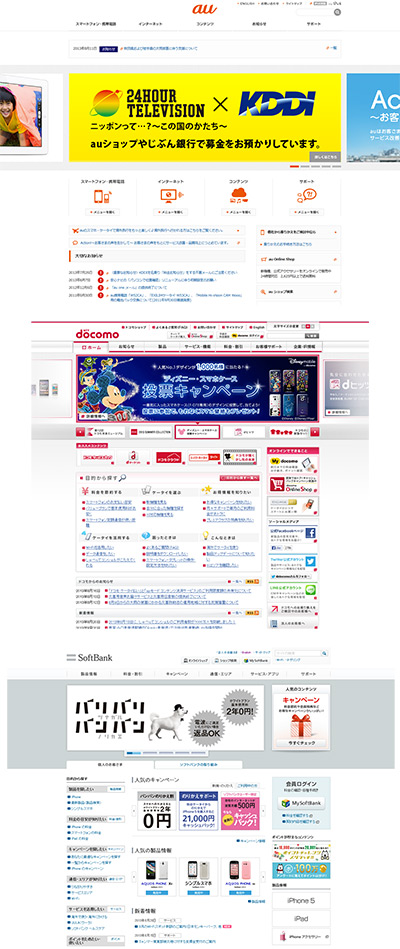
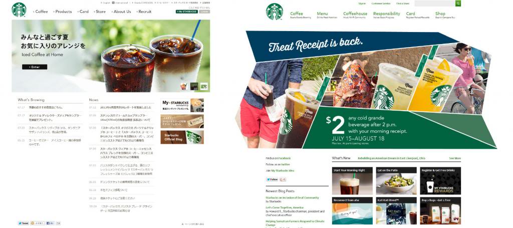
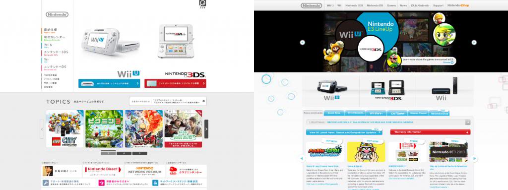
The overall width of Japanese sites appears to be slightly skinnier (950px) and a lot of the design is ‘compartmentalized’ into set rectangular areas.
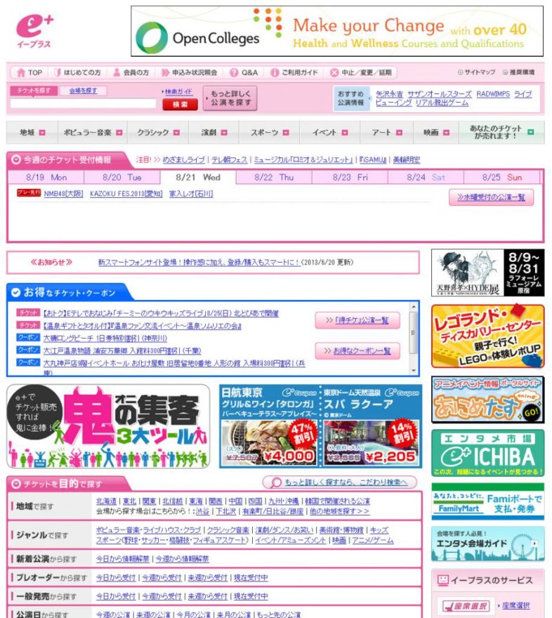
Considering the amount of time Japanese spend on their phones, it appears that the mobile versions of websites are designed first and appear more refined. This makes the desktop a secondary platform to design for and probably explains why desktop versions seem to be dragging behind our standards of ‘good web design’. A combination of dated usability, text heavy sites, small images and the use of flash (*shudder*) make Japanese web design seem dated. This is not just for sites by small corner shops or mum and dad businesses, this includes larger companies as well.
That said, it’s not all bad. There are many well designed sites, even if some are built in flash. Japan is definitely catching up but it still has a far way to go. It’s also interesting to compare Japanese and western versions of one brand together and note differences in layout and marketing strategies.
In part two I’ll be expanding on online technology and online social behaviours. Stay tuned!
This is an awesome post about Japanese design and online technology!
I liked the photo of the billboards in Akihabara – I can remember when I first got off the train there that the billboards were so striking that they were impossible to ignore. There’s so much colour through not only that suburb but all of Japan in general.
The mascot thing is cute too – didn’t know about the construction signs but that’s so Japanese! As for cute characters making info easier to digest – lol.
I think we should start incorporating that whole search bar thing into advertisements more. I agree it would seem easier to non web people when directing them on what to search, but I’m just not sure if western people would click if they saw the search bar in a print ad.