Earlier in the year I retired my completely filled art journal, which I’m sure was a relief for it because it was in pretty bad shape from living in my bag for so long >_<. I’m not the kind of person to re-visit an art journal once I move on but I thought I would share some of the ideas and alternate concepts that were never realised during it’s lifespan.
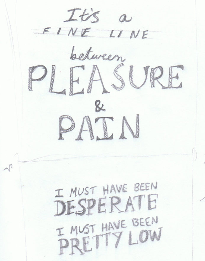
These were created after I had finished my ADGA poster entry and was experimenting with lyrics that I had decided not the use in the final design. They’re mostly just me getting rough ideas out of my head and onto paper. You can see an alternate version of the pleasure and pain lyrics from my post back in August last year.
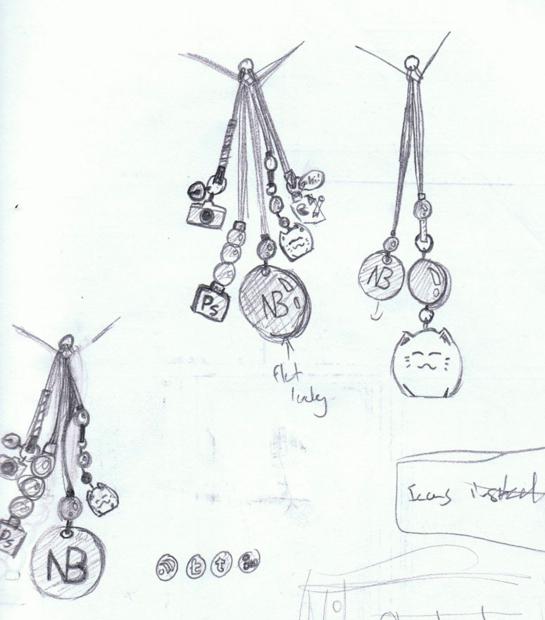
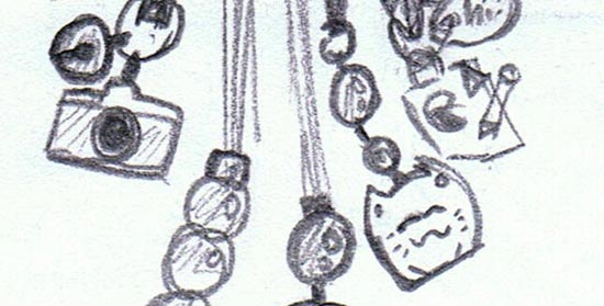
In my hopefully-coming-soon portfolio redesign, I wanted to add a bit of personality through a series of charms hanging off the navigation. If you know me, you know I have LOTS of key rings and charms hanging off my phone, wallet, house keys and bags. I did end up creating the charms but when I put it into the design it looked too heavy and distracting. Maybe I’ll upload a simpler version at a later date.
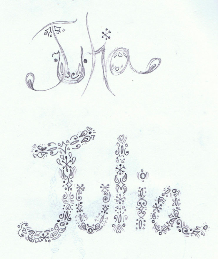
This was created last December when I was coming up with ideas for my friend’s birthday card. I wanted to keep it simple and make some type filled with patterns but I ended up not liking it and took another direction.
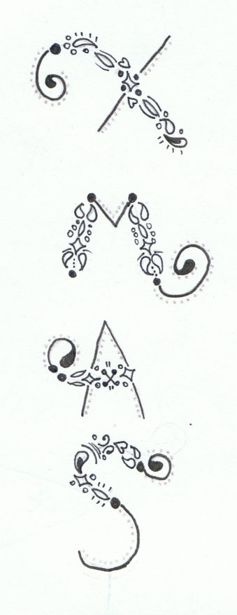
This was my original concept for the front of last year’s Christmas cards. I wasn’t feeling the vertical alignment and tried rearranging the letters but in the end it didn’t work out.
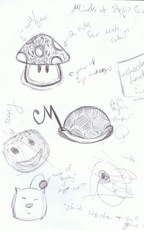
This was for another friend’s birthday card that ended up being the Power Up Mushroom (original sketch in the top left). I knew I wanted to create something game related and this is one of the pages of brainstorming – including a Turtle Shell (like those from Mario), Sackboy and a Moogle.
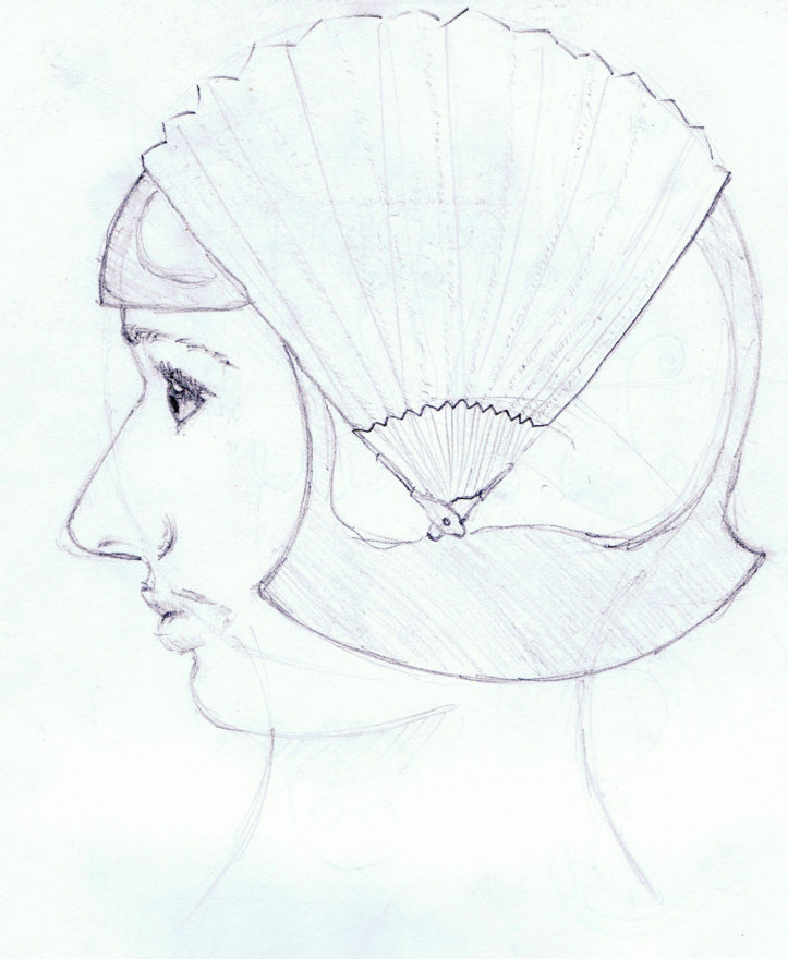
Sometimes I like to try and have a go at drawing again like I used to in high school. My skills are pretty rusty, this girl needs a nose reduction and a chin enhancement stat >_<. I should note – she’s supposed to look robotic, hence the shiny Astro boy hair.
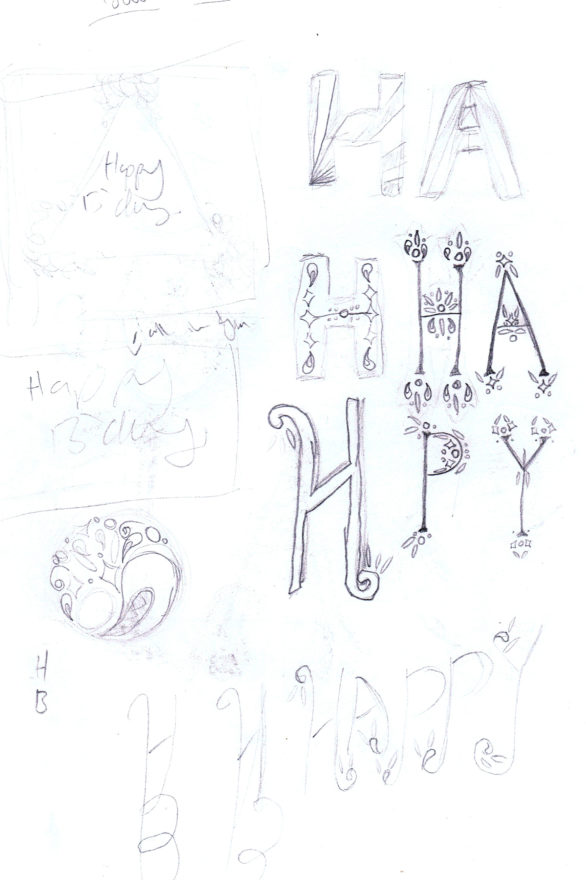
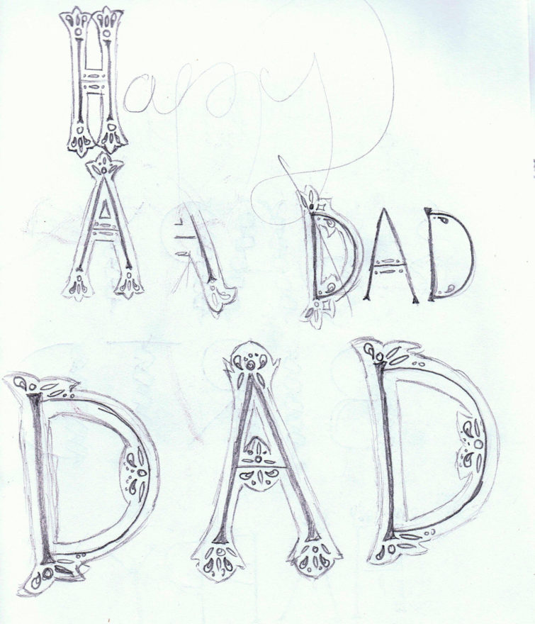
Alternate type ideas for my Dad’s birthday card back in March. Ended up choosing a much simpler design instead but I would like to use the ideas from these pages at some point for another project.
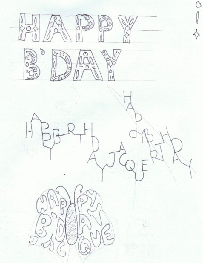
Birthday message ideas for my friend Jacque. Pretty experimental stuff, especially the lettering in the centre. The moth shaped one is based off her Made in the Now T-shirt design. I’m not very good at bubble writing and fitting type within shapes though. My final design became the first of my online birthday webpages.
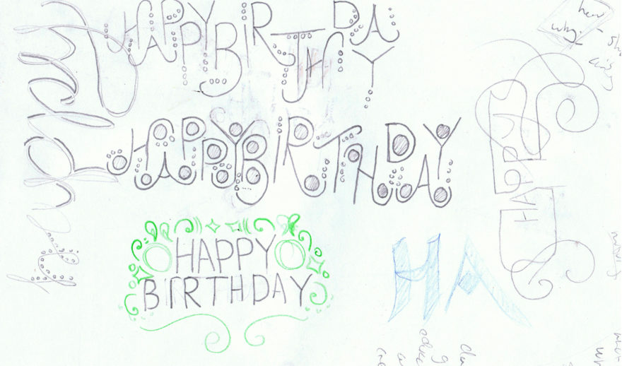
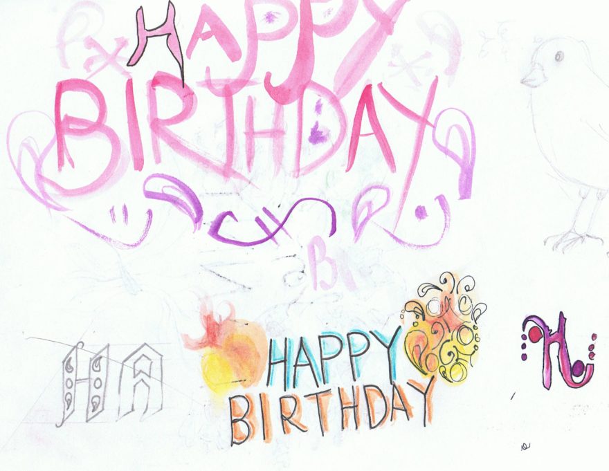
These were ideas for the card to my Nan, which ended up looking a lot different. Surprisingly this is one of the few pages with colour, something which I usually decide on later in development.
Do you look back at old journals or do you shelf it and leave it once you move on?

